“When you have Black women not voting because they say nothing is going to happen — that neither candidate is going to change anything — that is doomsday for Democrats”


Election Night: The Picture from the Data


Branden Snyder, a liberal organizer in Detroit, said he had conversations with other activists in the final weeks of the race about how strange they thought it was for Ms. Harris to bring Ms. Cheney, a former Republican House member from Wyoming, on the campaign trail in Detroit. Many progressive voters in the city viewed Ms. Harris as a centrist, he said, and they may have been better served hearing from a fellow liberal who could explain why they should be excited to support the vice president.


He said he vividly recalled realizing that Democrats were in trouble during the final weekend of the race when he was knocking on doors on the east side of Detroit and he could not find a way to persuade a middle-aged Black woman to cast her ballot. Black women have long been some of the Democratic Party’s most reliable voters.


“When you have Black women not voting because they say nothing is going to happen — that neither candidate is going to change anything — that is doomsday for Democrats,” Mr. Snyder said.


NYT, Nov 11 2024


From Monday, August 19th 2024 to August 22d, the Democratic National Convention was held in Chicago. A party’s national convention is technically where delegates - elected or otherwise - vote for the party’s presidential nominee. But at least recently, this is more a rubber stamp, confirming the results of primary elections and decisions behind closed doors. For the most part, a party’s national convention is more like an arena concert - the "DAC" and the "RAC".


The Democratic Party chose to hold their DAC in the United Center, just west of downtown Chicago (and off "screen", towards the "right", with respect to the banner picture). Generally an NBA and NHL stadium, it can also be used for concerts, housing about 22k people (making it the largest NBA stadium in the association).


On November 5th, Chicago, like cities across the nation, also saw cratering turnout, bleeding the Democrats much harder. Overall, Cook County (which houses Chicago) saw turnout fall by 11.6% (Illinois as a whole saw a fall of 11.8%). What happened?


Image 2
Figurex 1
Image 2
Figurex 1

Figure 1. I’ve tried to make these maps line up well, but it isn’t perfect, sorry. (1); decline in voter turnout from 2020 to 2024 (source); (2) Racial composition of Chicago neighborhoods (source) (3) Income categories of Chicago neighborhoods, 2017 (source)


Amy Qin at WBEZ Chicago (Chicago Sun Times) observed that Trump didn’t so much make gains in Chicago, as Harris lost votes. In fact, the heaviest losses were among black voters (compare slide 1 and 2), in terms of raw votes. But even compared to the raw ethno-racial populations, these are significant. What sticks out more, however, is not only the white/non-white lines of wealth inequality, but the cross-racial pattern of turnout fall with lower income. That is, the less a household makes, the less likely it appears they came out to vote.


Table V.I - Chicago demographics (wiki), and vote trends in communities majority of that ethno-racial group 2020 → 2024 (WBEZ Chicago)
Item 2020 Population 2020 Population % ΔDem (24, 20)* ΔDem (24, 20)/(2020 pop)† ΔGOP (24, 20)* ΔGOP (24, 20)/(2020 pop)†
white 863662 31.45% -48927 -5.7% -1998 -0.2%
black 787551 28.68% -72212 -9.2% +6549 +0.8%
Latino 819518 29.84% -43511 -5.3% +9827 +1.2%
No Majority -- -- -39932 -- +2737 --
Asian 189857 6.91% -862 -0.5% +240 +0.1%

*Note that these are changes in votes from neighborhoods that are majority 𝑋. So if a neighborhood has 55% black people, then they are part of the group in that row, even though the vote pattern in such a community isn’t 100% representative of black behavior.

†Thus these fractions are more to get a sense of scale, than a hard precise/accurate measurement.


In terms of votes, Biden won Cook County in 2020 with 1.73m votes against Trump’s 0.56m (total votes: 2.33m). In Chicago, Trump gained 0.016m votes since 2020, but Harris lost at least 0.205m votes - that is, 8.8% of the total 2020 Cook county votes, and 11.8% of Biden’s 2020 votes.


What happened? Illinois is a long-time Democrat stronghold, last voting for a Republican in 1988. They didn’t flip this year, but the stronghold’s blue citadel Chicago left a deep wound.


EDIT: From 2011 to 2019, Rahm Emanuel - chief of staff for the Obama white house from 2009-2010 - was mayor of the city.


What About New York City


In the NYT article "Trump Gained 95,000 Votes in New York City. Democrats Lost Half a Million.", the title tells the story (and gives an indication to the scale of vote loss Harris faced - half a million!). In fact, they find the same conclusion: Harris did horrible with low-income households, less bad with medium-income households, and best with high-income households. And by race, whites were easiest on Harris, and least favorable to Trump.


Overall, it sounds like about 3.0m votes were cast in NYC in 2020, and 2.6m in 2024. In 2020, Biden won 2.3m of those votes (and Trump 0.7m) - that is, Harris’s vote loss here (0.5736m) was 19% of the 2020 total votes, and 25% of the 2020 Biden votes. That is a huge collapse. Meanwhile, Trump’s gains of 0.0946m represent 3.2% of the 2020 total votes, and 13.5% of his 2020 votes (and 4.1% of Biden’s in 2020). Of course, Harris still wins the city handily (1.7m votes vs 0.8m), but the trend is terrible.


Image 2
Figurex 1
Image 2
Figurex 1

Figure 11. I’ve tried to make these maps line up well, but it isn’t perfect, sorry. (1, 2); decline in votes for Harris/Trump from 2020 to 2024 (source); (3) Median household income, 2010 (source); "Each dot on the map above represents 25 people (Red color: White, blue – Black, orange – Hispanic, green – Asian)." (4) source); (5) Poverty map (source)


How About Detroit?


Sherry Gay-Dagnogo hates to say I told you so.


For months, she said she had warned the Harris-Walz campaign that their message was not hitting with Detroiters. Vice President Kamala Harris didn’t outline a clear vision for change, Gay-Dagnogo said, didn’t empower surrogates to communicate economic policies, underestimated a revolt of young voters angered by the mounting death toll in Gaza and failed to disrupt negative perceptions shaped by Republican advertisements.


Former President Donald Trump swept back into power with decisive wins and record turnout in swing states, including Michigan. Detroit turnout was only 47%, lower than Democrats expected. Not only did Harris trail 19,307 votes behind President Joe Biden in 2020, she earned less than Hillary Clinton in 2016.


Gay-Dagnogo, who was reelected Tuesday to the Detroit school board, said Trump’s victory confirmed her worst fears. Now Detroit leaders are contending with what will likely be a frayed relationship with the incoming president, and potential drops in federal support for struggling communities.


BridgeDetroit (describes itself as "a nonprofit community news, information and engagement media service in America’s largest majority African American city.")


Well, couldn’t have said it better myself. Wayne County is home to large Arab majority communities - and understandably, amidst the Gaza Genocide, they didn’t turn out for Harris. Lot’s of polemics have been aimed at this, and Trump did some actual gains here - though falling turnout appears to be the bigger story.


But the issues in Detroit go beyond Dearborn and Hamtramck.


Image 2
Figurex 1
Image 2
Figurex 1

Figure 11. I’ve tried to make these maps line up well, but it isn’t perfect, sorry. (1, 2); decline in votes for Harris/Trump from 2020 to 2024; yellow areas = "Precincts where Arabs are the largest ethnic group" (source); (3) Median household income, 2016 (source); (4) Each dot is 25 people source);


In low income Latino and black areas (which one can see is nearly the entire mapped region for said racial groups), turnout for Harris fell, with Trump picking up voters, albeit fewer (though roughly equal in some Latino precincts). In relatively-medium income white areas, such as around Lincoln Park, Harris lost votes, and Trump gained roughly an equal amount, though in Downtown Detroit (with a mix of white and black), Harris lost more than Trump gained (one must be careful with "White" on these maps, as the category includes Arabs).


For Wayne County as a whole, the actual turnout didn’t so much as decrease, as it did increase far less than the rest of the state (this is a similar situation as Atlanta, Georgia). Wayne County’s turnout (in which Detroit is housed) did rise, by 0.2%. - but overall, Michigan turnout increased by 1.8%, rural turnout by 2.7%, and suburban by 1.9% (Michigan’s other "Urban" county, Kent, saw turnout increase by 1.6%), all far outpacing Wayne County.


To continue the quotes:


Gay-Dagnogo said she’s among a group of Black political leaders whose concerns were ignored by the campaign.


“I wish I wasn’t right,” she said Wednesday. “It was too little too late and that’s always the Democratic way. I don’t know if they’ll learn. They’ve become immune to the stench of dysfunction.”


The Harris campaign engaged Black voters with near-daily events at churches, union halls, house parties, Divine Nine Greek organizations, barber shops and beauty salons. They brought in actors, musicians, political leaders and influencers to persuade voters.


Branden Snyder, director of Michigan Election Defense Coalition, said he encountered voters who didn’t think Harris was talking enough about improving the economy and working class issues. Harris had a plan to provide down-payment assistance to first-time homebuyers and tax credits for new parents, but voters weren’t familiar with it.


...


Benji Ballin, 28, was a paid canvasser for the Harris campaign who said he encountered enough Detroiters on the fence to make him nervous. He said some voters planned to vote in down-ballot races but not the presidential race.


Clips circulating on social media ahead of the election showed Harris saying she wouldn’t do anything differently than Biden and supported economic policies that would benefit all of society rather than Black people specifically. Social media users sharing the interviews said it showed Harris wasn’t focused on helping Black voters.


Scott Holiday, director of nonprofit advocacy group Detroit Action, said Harris couldn’t articulate a winning message on improving the economy. Instead, Holiday said voters were told to fear Trump.


“We saw the best turnout in 2008 and that happened through hope and change – people wanted something and were willing to (vote) to get it,” Holiday said. “That simply wasn’t the case here. The majority of Democratic messaging was ‘be afraid of this man.’ I don’t like Trump’s messaging but he was giving his base something to fight for.”


Justin Onwenu, a Detroit activist and entrepreneurship director for the city, said rage against Trump didn’t translate into a Democratic victory in 2016. Onwenu, a delegate for Bernie Sanders in 2020, was knocking doors for the Harris campaign in Detroit.


...


Snyder worked for Clinton’s 2016 campaign. He said the Harris team made a similar mistake by trying to pull Republicans to their side. Allying with former Vice President Dick Cheney and his daughter may have done more harm than good, he said.


Snyder said former President Bill Clinton also “didn’t do any favors” by saying Israel was forced to kill civilians during a campaign stop in Benton Harbor. Arab American and Muslim communities were deeply angered by Harris’ support for Israel’s wars in Lebanon and Gaza.


...


Trump overtly pledged to end the wars during visits with Muslim leaders in Michigan.


Harris pledged to secure a ceasefire but ignored calls to end military aid for Israel. During her final campaign rally in Michigan, Harris said she would “will do everything in my power to end the war in Gaza.”


Holiday said the Harris campaign may have focused too much on the prospect of a national abortion ban. Though reproductive freedom is vitally important, he said, “people wanted to vote with their wallet.”


Gay-Dagnogo agreed. She argues the campaign put too much focus on protecting abortion rights in a state that already mobilized voters around that issue in 2023.


“Black elected women (told the campaign) the community is tired of hearing about abortion,” Gay-Dagnogo said. “It’s an important issue but we want to get bread and butter issues in the way the inner city needs to hear. The housing crisis, the cost of food.”


Democratic vice presidential nominee Tim Walz made abortion the centerpiece of his closing argument to Detroiters during a Monday campaign visit.


Snyder said the emphasis on the potential threat Trump poses to democratic norms, while important, was a nebulous issue for working class voters.


“Don’t get me wrong, I believe it and understand the concerns of Project 2025, but for a lot of Black voters democracy doesn’t work in a lot of places already,” Snyder said. “I don’t know if the hand wringing around fascism was enough to move people.”


Table MI.GOP.Income - Correlation of county income metrics with county ΔActualGOP
Type A-GOP TO 20 A-GOP TO 24 ΔA-GOP TO Corr(Median Income) Corr(Poverty) Corr(Poverty150) Corr(Gini)
All 0.33445139 0.35688179 0.0224304 -0.1079149 0.191616 0.11496607 -0.19494129
Rural (57) 0.42816444 0.45377835 0.0256139 -0.108988 0.202798 0.15239033 -0.09109297
Rural+ Suburban 0.36682851 0.3892755 0.022447 -0.097733 0.195648 0.10953887 -0.19718586
Suburban (24) 0.34750162 0.36875235 0.02125073-0.283476 0.239337 0.08994 -0.55907842
Suburban+ Urban 0.31346339 0.33488323 0.02141984-0.289308 0.213184 0.09160 -0.53179497
Urban (2) 0.22981926 0.25051747 0.02069821-1. 1. 1. 1.

Table MI.GOP.Racial - Correlation of county racial composition with county ΔActualGOP
Type A-GOP TO 20 A-GOP TO 24 ΔA-GOP TO Corr(white) Corr(black) Corr(Latino) Corr(Asian+) Corr(AIAN)
All 0.33445139 0.35688179 0.0224304 0.16085422 -0.15084752 0.07107301 -0.140665 -0.11992958
Rural (57) 0.42816444 0.45377835 0.0256139 0.13574587 -0.27918538 0.17426625 0.04587313 -0.12573912
Rural+ Suburban 0.36682851 0.3892755 0.022447 0.174417 -0.18915216 0.09907844 -0.13348359 -0.12311403
Suburban (24) 0.34750162 0.36875235 0.021250730.51676287 -0.4054399 -0.26318967 -0.52867996 0.10857819
Suburban+ Urban 0.31346339 0.33488323 0.021419840.42991405 -0.2961431 -0.32909521 -0.53027475 0.09869631
Urban (2) 0.22981926 0.25051747 0.020698211. 1. -1. 1. -1.

Table MI.Dem.Income - Correlation of county income metrics with county ΔActualDem
Type A-Dem TO 20 A-Dem TO 24 ΔA-Dem TO Corr(Median Income) Corr(Poverty) Corr(Poverty150) Corr(Gini)
All 0.35391128 0.34673234 -0.007178940.35899249 -0.34593514 -0.35225292 0.00406062
Rural (57) 0.2555027 0.25894122 0.003438510.5805016 -0.27680534 -0.41418337 0.20249212
Rural+ Suburban 0.33367368 0.3317165 -0.001957180.36511914 -0.25525703 -0.31383036 0.12470802
Suburban (24) 0.35830526 0.35487173 -0.003433540.0776572 -0.20614434 -0.05466396 -0.05359827
Suburban+ Urban 0.37595089 0.36666368 -0.009287210.22523473 -0.48031677 -0.3137593 -0.29228558
Urban (2) 0.41931251 0.39603666 -0.023275851. -1. -1. -1.

Table MI.Dem.Racial - Correlation of county racial composition metrics with county ΔActualDem
Type A-Dem TO 20 A-Dem TO 24 ΔA-Dem TO Corr(white) Corr(black) Corr(Latino) Corr(Asian+) Corr(AIAN)
All 0.35391128 0.34673234 -0.007178940.25328938 -0.40838654 0.14956236 -0.04920619 0.0204632
Rural (57) 0.2555027 0.25894122 0.003438510.06835365 -0.33781602 0.17435815 0.15754418 0.01341136
Rural+ Suburban 0.33367368 0.3317165 -0.001957180.09017706 -0.23057493 0.19226764 0.00849873 0.00779077
Suburban (24) 0.35830526 0.35487173 -0.003433540.24883646 -0.3874942 0.27893373 -0.1016253 0.1287044
Suburban+ Urban 0.37595089 0.36666368 -0.009287210.55362547 -0.68981691 0.18732071 -0.13367405 0.13315814
Urban (2) 0.41931251 0.39603666 -0.023275851. -1. 1. -1. 1.

Image 2
Figurex 1
Image 2
Figurex 1

CAPTION (1);


Keep in mind: if the correlation is weak for change in turnout, it means that the group was neither "turned off" or "on" by the given party. If the correlation is significant (ie magnitude ≥ 0.30-ish), that means that a group was "turned off" or "on" by a given party.


In terms of racial groups, the GOP saw no significant trends, while the Dems saw moderate increasing turnout in whiter counties, moderate falling turnout in blacker counties. In terms of income groups, the GOP again saw no significant trends, whereas Dems saw moderate increasing turnout in higher-income counties, and moderate falling turnout in counties with increasing poverty.


Looking at the actual-party-turnout-change tables, we see a few notable trends. The GOP saw gains in all types of regions, but did better in rural areas. The income picture is somewhat ambiguous. There’s a negative correlation with income (ie stronger turnout with lower income counties) and also Gini coefficient (stronger turnout in more income-equal counties), though none of these values are particularly significant (the urban values are solid 1’s because there are only two such counties; the correlation can thus only be 1 or -1). With poverty, there is weak positive correlation. So the county-level resolution correlations suggest Trump weakly does better with lower income voters than higher.


In terms of race (setting aside the urban counties alone, due to there just being two), the GOP did good with suburban whites, and did bad with suburban black and Asian voters, as well as suburban+Urban Latinos. The urban data, and the suburban+urban data, suggests he did see gains with urban black voters. Correlations are otherwise weak, negative or positive.


For Dems, turnout fell for all region types, except a slight gain in rural counties. Interesting. In light of income, Dems had significant negative correlations with poverty rates (weak mixed signs for Gini); only in rural counties did Dems see significant correlation with income (maybe with urban, given the suburban+urban correlation), though it’s positive signs across the board. In terms of race, there is little pattern in rural counties (other than negative correlation with rural black voters). For suburban voters it’s the same idea, but stronger positive correlations (yet still weak) with white and Latino voters. For white voters, this appears to strengthen into the cities, and worsten with black, Latino, and Asian voters.


Atlanta


Image 2
Figurex 1
Image 2
Figurex 1

Figure 11. I’ve tried to make these maps line up well, but it isn’t perfect, sorry. (1, 2); decline in votes for Harris/Trump from 2020 to 2024; yellow areas = "White precincts" (source); (3, 4, 5, 6) (3, 4) Racial map (blue - white; yellow - hispanic; green - black; red - asian; brown - multiple/other), (5, 6) Median household income (green - high; yellow - average, red - low); median household income of Atlanta: $88,337 (source); 4 and 6 show overlap of Harris gains (blue colors) and losses (red colors); the darker the color, the more intense the trend (located at the base of peaks from the NYT maps, the intensity based on the height of the peak); I switched the color of the income map, to make seeing these easier


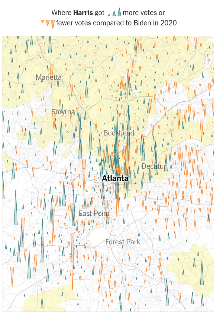
This is a unique bellweather - Harris registered both losses and gains in non-white areas, many of large magnitude. Meanwhile, Trump saw losses in some white areas, and modest gains elsewhere. Harris remained competitive in some low-income areas, but overall, it was a wash for her in low-income non-white areas. The most competetive spots were white, higher-income areas.


In southwest Atlanta, which is majority black with a range of income levels, I’ve tried to localize some of the Harris gain/loss peaks, and to color them roughly in accordance with the magnitude of the peaks (slides 4, 6). I don’t recommend using these color-dots to indicate the magnitude, but just to try to help localize where peaks are from slide 1, on the income map and race map.


What this seems to show - for southwest Atlanta - is that Harris’s big gains here were in the upper income black communities, with more consistent losses in lower-income areas, though the big drops appear scattered across income groups. For Trump, the trend is much more muted, with very modest gains throughout; perhaps a trend is discernable visually.


Yet one should also keep in mind the peculiar qualities of Atlanta. While geographically metro Atlanta is large, it’s density is highly variable (ie see this map), famously with woods interspersed throughout the city. The city proper has about 500,000 people; Fulton county around 1m in 534 mi², or about 2000 people/mi² - and Fulton County isn’t even the whole sprawl! By comparison, New York city’s land area is 300 mi², with 29,300 people/mi²; Chicago has a land area of about 235 mi² and a density of 12100 people/mi²; Los Angeles an area of 470 mi² with 8200 people/mi². Wayne County Michigan, home to the famously hollowed-out Detroit, has an area of about 612 mi², and still a larger density of of 2700 people/mi²!


This isn’t to say Atlanta isn’t thriving, but it’s pretty unique.


Table C.I - Correlation of county income metrics with change in county turnout, for several states
Item Type 2020 TO 2024 TO Corr(Median Income) Corr(Poverty) Corr(Poverty150) Corr(Gini) %Δ turnout†
Georgia All 60.9% 62.3% 0.2045 -0.4035 -0.3053 -0.2071 +1.3%
Rural 56.6% 59.0% 0.4598 -0.6011 -0.4584 -0.2244 +2.4%
Rural+ Suburban 60.8% 62.2% 0.2122 -0.4079 -0.3097 -0.2033 +1.4%
Suburban 61.8% 62.9% 0.0061 -0.1947 -0.1328 -0.0976 +1.1%
Suburban+ Urban 61.8% 62.9% -0.0031 -0.1892 -0.1282 -0.1156 +1.1%
Urban 62.1% 62.9% -- -- -- -- +0.8%

† Note that these turnout values may be different than in table t.I, because the values here are pulled from Wikipedia (for the convenient table formatting), and may be slightly out-of-date with AP reporting. And it seems, some odd discrepancy between county and statewide vote (not sure if there is a methodological reason why, or...)


Values computed by taking the correlation of county-level Δturnout from 2020 to 2024 (DTO) with a given factor, either for all counties, or for regional type counties (ie Rural, Suburban, Urban).


Voter-eligible population (VEP) in 2020 and 2023 computed by multiplying the 2020 and 2023 county-level population by the 2018-2022 percent population that is 18+ years old. Turnout computed by dividing total votes in 2020 and 2024 by the VEP in 2020 and 2023. Note that the VEP in 2024 is probably slightly different from 2023, but it’s the closest value available at the moment. The Δturnout from 2020 to 2024 (DTO) is computed as the county-level difference between the 2020 and 2024 turnout.


2020 and 2023 county-level populations from Census Office; County-level total votes in 2020 and 2024 from Wikipedia; 2015 county-level Gini coefficients from here; county-level <18-year-old percent (100 - <18% = 18+%), households below poverty, persons below 150% of the poverty threshold, income level, and racial composition from NIH. Rural, Suburban, and Urban classification of counties from Pew (higher resolution version of that map here).


Table C.II - Correlation of county racial composition with change in county turnout, for several states
Item Type 2020 TO 2024 TO W:B:L:A:AI Corr(white) Corr(black) Corr(Latino) Corr(Asian+) Corr(AIAN) %Δ turnout†
Georgia All 60.9% 62.3% 0.5926 -0.5423 -0.0503 -0.1245 0.0229 +1.3%
Rural 56.6% 59.0% 66.8: 24.7: 7.4: 1.1: 0.4 0.5699 -0.5550 0.0557 0.2180 0.0861 +2.4%
Rural+ Suburban 60.8% 62.2% 57.4: 29.3: 10.1: 3.6: 0.3 0.5920 -0.5412 -0.0502 -0.1184 0.0222 +1.4%
Suburban 61.8% 62.9% 55.1: 30.3: 10.8: 4.1: 0.3 0.6167 -0.5190 -0.1470 -0.3304 -0.0356 +1.1%
Suburban+ Urban 61.8% 62.9% 53.4: 31.9: 10.3: 4.6: 0.3 0.6191 -0.5225 -0.1463 -0.3375 -0.0338 +1.1%
Urban 62.1% 62.9% 41.0: 43.4: 7.3: 7.6: 0.2 -- -- -- -- +0.8%

† Note that these turnout values may be different than in table t.I, because the values here are pulled from Wikipedia (for the convenient table formatting), and may be slightly out-of-date with AP reporting. And it seems, some odd discrepancy between county and statewide vote (not sure if there is a methodological reason why, or...)


Values computed by taking the correlation of county-level Δturnout from 2020 to 2024 (DTO) with a given factor, either for all counties, or for regional type counties (ie Rural, Suburban, Urban).


Voter-eligible population (VEP) in 2020 and 2023 computed by multiplying the 2020 and 2023 county-level population by the 2018-2022 percent population that is 18+ years old. Turnout computed by dividing total votes in 2020 and 2024 by the VEP in 2020 and 2023. Note that the VEP in 2024 is probably slightly different from 2023, but it’s the closest value available at the moment. The Δturnout from 2020 to 2024 (DTO) is computed as the county-level difference between the 2020 and 2024 turnout.


2020 and 2023 county-level populations from Census Office; County-level total votes in 2020 and 2024 from Wikipedia; 2015 county-level Gini coefficients from here; county-level <18-year-old percent (100 - <18% = 18+%), households below poverty, persons below 150% of the poverty threshold, income level, and racial composition from NIH. Rural, Suburban, and Urban classification of counties from Pew (higher resolution version of that map here).


Table GA.GOP.Income - Correlation of county income metrics with county ΔActualGOP
Type A-GOP TO 20 A-GOP TO 24 ΔA-GOP TO Corr(Median Income) Corr(Poverty) Corr(Poverty150) Corr(Gini)
All 0.29997045 0.31581772 0.01584727 -0.03915857 -0.16774771 -0.09728921 -0.08435934
Rural (85) 0.39208834 0.42266062 0.03057228 0.42539921 -0.52301835 -0.48916775 -0.34239328
Rural+ Suburban0.31570451 0.33220553 0.01650102 -0.0299676 -0.1737466 -0.10335351 -0.07367631
Suburban (73) 0.29773295 0.31110407 0.01337112 -0.17180949 -0.02406038 0.03878745 0.08148545
Suburban+ Urban0.28098445 0.29392553 0.01294108 -0.17975881 -0.01907911 0.04294664 0.05197435
Urban (1) 0.16266275 0.16989975 0.007237 nan nan nan nan

Table GA.GOP.Racial - Correlation of county racial composition with county ΔActualGOP
Type A-GOP TO 20 A-GOP TO 24 ΔA-GOP TO Corr(white) Corr(black) Corr(Latino) Corr(Asian+) Corr(AIAN)
All 0.29997045 0.31581772 0.01584727 0.55023655 -0.47146875 -0.11890136 -0.25499502 -0.02092001
Rural (85) 0.39208834 0.42266062 0.03057228 0.55766505 -0.5346962 0.00257813 0.11549313 0.04022401
Rural+ Suburban0.31570451 0.33220553 0.01650102 0.54726884 -0.46885047 -0.1189917 -0.2460013 -0.02218983
Suburban (73) 0.29773295 0.31110407 0.01337112 0.57307987 -0.46902784 -0.17442574 -0.33427358 -0.07075831
Suburban+ Urban0.28098445 0.29392553 0.01294108 0.57663229 -0.47347686 -0.17355839 -0.34234616 -0.06877354
Urban (1) 0.16266275 0.16989975 0.007237 nan nan nan nan nan

Table GA.Dem.Income - Correlation of county income metrics with county ΔActualDem
Type A-Dem TO 20 A-Dem TO 24 ΔA-Dem TO Corr(Median Income) Corr(Poverty) Corr(Poverty150) Corr(Gini)
All 0.30140569 0.30216807 0.00076238 0.50642111 -0.54995111 -0.48801519 -0.30183419
Rural (85) .16809704 0.16512879 -0.00296825 0.39365678 -0.51150259 -0.31672718 -0.04002074
Rural+ Suburban.28430718 0.28535217 0.00104499 0.50890976 -0.55025376 -0.48825337 -0.30927349
Suburban (73) .31164907 0.31339802 0.00174895 0.45325689 -0.45119313 -0.45363722 -0.4468128
Suburban+ Urban.32888132 0.33024752 0.0013662 0.44639737 -0.44862907 -0.45141278 -0.43133733
Urban (1) .45062063 0.45189775 0.00127712 nan nan nan nan

Table GA.Dem.Racial - Correlation of county racial composition with county ΔActualDem
Type A-Dem TO 20 A-Dem TO 24 ΔA-Dem TO Corr(white) Corr(black) Corr(Latino) Corr(Asian+) Corr(AIAN)
All 0.30140569 0.30216807 0.00076238 0.31636288 -0.35031622 0.10002535 0.17184507 0.06631396
Rural (85) .16809704 0.16512879 -0.00296825 0.43555213 -0.43636323 0.09844198 0.27851524 0.09900717
Rural+ Suburban.28430718 0.28535217 0.00104499 0.31983156 -0.35243103 0.09999092 0.17266758 0.06662693
Suburban (73) .31164907 0.31339802 0.00174895 0.20887119 -0.22500468 0.06358547 -0.02372477 0.06865114
Suburban+ Urban.32888132 0.33024752 0.0013662 0.21022047 -0.2263268 0.06367002 -0.02887666 0.06917196
Urban (1) .45062063 0.45189775 0.00127712 nan nan nan nan nan

Image 2
Figurex 1
Image 2
Figurex 1

CAPTION (1);


Houston


Image 2
Figurex 1
Image 2
Figurex 1

Figure 11. I’ve tried to make these maps line up well, but it isn’t perfect, sorry. (1, 2); decline in votes for Harris/Trump from 2020 to 2024; yellow areas = "Latino precincts where the median income is less than $50,000" (source); (3, 4) (3) Racial map (blue - white; yellow - hispanic; green - black; red - asian; brown - multiple/other), (5, 6) Median household income (green - high; yellow - average, red - low); median household income of Houston: $80,425 (source); (5) population density map (source)


NYT argues "Trump achieving sharp gains, especially in Latino neighborhoods and lower-income areas. Ms. Harris’s vote total was down 12 percent overall from Mr. Biden’s in 2020, and 28 percent in low-income neighborhoods where Latino voters are the largest group."


Yet it’s worth observing (A) in Hispanic/Latino areas, the big peaks are in higher income areas, and (B) those are areas with, generally, lower population density! I’m not sure if NYT is reporting here change in percent vote, or change in raw vote, but if its the former, then point B is moot, and if its the latter, then it shows a very disproportionate increase in Trump support among higher-income Latino voters. The peaks within lower-income Latino areas are generally shorter for Trump, though the peak magnitudes are generally substantial for Harris, although also a bit shorter.


Yes, Harris and Trump probably saw bigger gains and losses in low-income Latino neighborhoods vs high-income neighborhoods, but that’s almost a given, as there are far more such neighborhoods (with higher density) than high-income Latino neighborhoods. The low-income neighborhood trend is similar for black neighborhoods. White neighborhoods are nearly all higher-income, and they see, broadly, a fall in vote for both candidates, with some exceptions.


Table TX.GOP.Income - Correlation of county income metrics with county ΔActualGOP
Type A-GOP TO 20 A-GOP TO 24 ΔA-GOP TO Corr(Median Income) Corr(Poverty) Corr(Poverty150) Corr(Gini)
All 0.26959224 0.28040533 0.01081309 0.17433049 -0.07987842 -0.10579944 -0.00423603
Rural (173) .40341449 0.41866071 0.01524622 0.30835664 -0.11006093 -0.15634673 -0.01645134
Rural+ Suburban.32638712 0.34027452 0.0138874 0.1860019 -0.08159437 -0.10871193 -0.00309959
Suburban (75) .3065327 0.32099662 0.01446392 -0.14071945 0.19855549 0.2512469 0.14471636
Suburban+ Urban.25354462 0.26427147 0.01072686 -0.16032865 0.20546044 0.25948113 0.1216286
Urban (6) .20676364 0.21231078 0.00554714 -0.65626771 0.60044274 0.6679699 0.35413408

Table TX.GOP.Racial - Correlation of county racial composition with county ΔActualGOP
Type A-GOP TO 20 A-GOP TO 24 ΔA-GOP TO Corr(white) Corr(black) Corr(Latino) Corr(Asian+) Corr(AIAN)
All 0.26959224 0.28040533 0.01081309 0.11338802 -0.0581838 -0.08364421 0.09882832 -0.06116284
Rural (173) .40341449 0.41866071 0.01524622 0.13458119 -0.05701919 -0.11598403 0.42089643 -0.06881424
Rural+ Suburban.32638712 0.34027452 0.0138874 0.11290344 -0.05607643 -0.08413635 0.13078174 -0.06096102
Suburban (75) .3065327 0.32099662 0.01446392 -0.03182782 -0.0865908 0.2431565 -0.08015209 0.06920066
Suburban+ Urban.25354462 0.26427147 0.01072686 -0.00157672 -0.10231003 0.24299585 -0.12217363 0.06648319
Urban (6) .20676364 0.21231078 0.00554714 -0.15032533 -0.088623 0.85919511 -0.75711632 0.73058558

Table TX.Dem.Income - Correlation of county income metrics with county ΔActualDem
Type A-Dem TO 20 A-Dem TO 24 ΔA-Dem TO Corr(Median Income) Corr(Poverty) Corr(Poverty150) Corr(Gini)
All 0.24113977 0.21242247 -0.0287173 0.33744508 -0.36646712 -0.41939004 -0.1490755
Rural (173) .12567493 0.11063081 -0.01504413 0.52645893 -0.36683741 -0.47424524 -0.11418053
Rural+ Suburban.19280015 0.17272472 -0.02007543 0.39113982 -0.38269801 -0.44348504 -0.13796946
Suburban (75) .2101022 0.18799577 -0.02210643 0.28158478 -0.53936414 -0.44504992 -0.30602148
Suburban+ Urban.25471721 0.22408194 -0.03063527 0.15732843 -0.46200538 -0.36634409 -0.3697393
Urban (6) .29410594 0.25713715 -0.03696879 -0.27043419 0.08011702 0.11122735 -0.42393097

Table TX.Dem.Racial - Correlation of county racial composition with county ΔActualDem
Type A-Dem TO 20 A-Dem TO 24 ΔA-Dem TO Corr(white) Corr(black) Corr(Latino) Corr(Asian+) Corr(AIAN)
All 0.24113977 0.21242247 -0.0287173 0.42974747 -0.08561366 -0.46012195 -0.07645281 -0.0997293
Rural (173) .12567493 0.11063081 -0.01504413 0.37393907 -0.05492379 -0.45663349 0.29541485 -0.14575454
Rural+ Suburban.19280015 0.17272472 -0.02007543 0.40970507 -0.05439809 -0.46745857 -0.00101003 -0.09486601
Suburban (75) .2101022 0.18799577 -0.02210643 0.62833513 -0.05713244 -0.58658668 -0.31963912 0.26599874
Suburban+ Urban.25471721 0.22408194 -0.03063527 0.66637467 -0.13797671 -0.54671953 -0.42782588 0.19564325
Urban (6) .29410594 0.25713715 -0.03696879 -0.05592997 0.09467826 0.05348072 -0.199505 -0.23464676

Image 2
Figurex 1
Image 2
Figurex 1

CAPTION (1);


Milwaukee?


DO THE MAP THING


Homeownership/Income/Race

Race

NYT turnout

Income


Milwaukee is quite instructive. Harris’s gains were predominately in white and mixed areas, ranging from low to relatively-high income. Notably, the downtown area was the most competetitive - the business area, the "safe" area - with both candidates seeing gains. As elsewhere, Harris saw losses in lower income non-white areas, with Trump seeing gains, albeit smaller than Harris’ losses.


Table WI.GOP.Income - Correlation of county income metrics with county ΔActualGOP
Type A-GOP TO 20 A-GOP TO 24 ΔA-GOP TO Corr(Median Income) Corr(Poverty) Corr(Poverty150) Corr(Gini)
All 0.3481849 0.36614035 0.01795545 -0.18790257 -0.08705793 0.10598417 -0.13597941
Rural (46) .41025137 0.43639455 0.02614318 0.09349915 -0.31195019 -0.14282986 -0.20557081
Rural+ Suburban.37748175 0.39599977 0.01851802 -0.20898465 -0.036526 0.1538974 -0.13971148
Suburban (25) .36264266 0.37779715 0.01515449 -0.29458261 0.17883866 0.3646735 -0.34441973
Suburban+ Urban.32598075 0.34095808 0.01497733 -0.19941549 -0.02517067 0.15922463 -0.387593
Urban (1) .18804066 0.19769728 0.00965661 nan nan nan nan]

Table WI.GOP.Racial - Correlation of county racial composition with county ΔActualGOP
Type A-GOP TO 20 A-GOP TO 24 ΔA-GOP TO W:B:L:A:AI Corr(white) Corr(black) Corr(Latino) Corr(Asian+) Corr(AIAN)
All 0.3481849 0.36614035 0.01795545 0.37704596 -0.21805721 -0.32720047 -0.31422511 -0.22817205
Rural (46) .41025137 0.43639455 0.02614318 0.36988306 0.09260332 -0.21198589 0.03324247 -0.34991283
Rural+ Suburban.37748175 0.39599977 0.01851802 0.34978799 -0.18153058 -0.29376028 -0.28745391 -0.23436543
Suburban (25) .36264266 0.37779715 0.01515449 0.39009944 -0.24075121 -0.31902425 -0.41629391 0.00210336
Suburban+ Urban.32598075 0.34095808 0.01497733 0.38474673 -0.27659851 -0.36738362 -0.44362504 -0.01046434
Urban (1) .18804066 0.19769728 0.00965661 nan nan nan nan nan]

Table WI.Dem.Income - Correlation of county income metrics with county ΔActualDem
Type A-Dem TO 20 A-Dem TO 24 ΔA-Dem TO Corr(Median Income) Corr(Poverty) Corr(Poverty150) Corr(Gini)
All 0.35265716 0.35980007 0.00714291 0.43016546 -0.39848464 -0.38536933 0.01425196
Rural (46) .27398649 0.27710395 0.00311747 0.40778381 -0.3700647 -0.35877195 0.06240325
Rural+ Suburban.33594961 0.34327095 0.00732134 0.44665662 -0.46559358 -0.42982026 0.01572147
Suburban (25) .36400841 0.37308699 0.00907858 0.17763298 -0.30713141 -0.12601323 0.27405986
Suburban+ Urban.38080143 0.38944208 0.00864065 0.1369393 -0.14788296 -0.04986004 0.28027375
Urban (1) .44398498 0.4530442 0.00905923 nan nan nan nan]

Table WI.Dem.Racial - Correlation of county racial composition with county ΔActualDem
Type A-Dem TO 20 A-Dem TO 24 ΔA-Dem TO W:B:L:A:AI Corr(white) Corr(black) Corr(Latino) Corr(Asian+) Corr(AIAN)
All 0.35265716 0.35980007 0.00714291 0.09161573 0.13313934 0.11408337 0.56657759 -0.25408485
Rural (46) .27398649 0.27710395 0.00311747 0.21841103 0.10427195 0.12260543 0.46842169 -0.25705312
Rural+ Suburban.33594961 0.34327095 0.00732134 0.13883221 0.09750311 0.07794817 0.56339085 -0.25312626
Suburban (25) .36400841 0.37308699 0.00907858 -0.05020484 -0.15505 -0.17459588 0.56536501 -0.06002001
Suburban+ Urban.38080143 0.38944208 0.00864065 -0.09173923 0.00137283 -0.1056161 0.56507982 -0.05468766
Urban (1) .44398498 0.4530442 0.00905923 nan nan nan nan nan]

Image 2
Figurex 1
Image 2
Figurex 1

CAPTION (1);


Miami


Image 2
Figurex 1
Image 2
Figurex 1

Figure 11. I’ve tried to make these maps line up well, but it isn’t perfect, sorry. (1, 2); decline in votes for Harris/Trump from 2020 to 2024; yellow areas = "Latino precincts where the median income is less than $50,000" (source); (3, 4) (3) Racial map (blue - white; yellow - hispanic; green - black; red - asian; brown - multiple/other), (5, 6) Median household income (green - high; yellow - average, red - low); median household income of Miami: $76,100 (source)


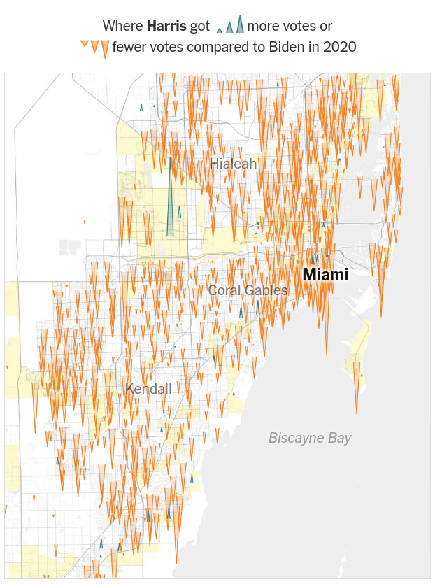
Miami is certainly interesting. What stands out from is not just a collapse in turnout for Harris, and the standard smaller gains for Trump, but the substantial Trump gains in (A) downtown Miami and (B) the more affluent outer neighborhoods. In fact, it was in such middle- and higher-income areas that Harris saw any of her substantial gains, albeit far rarer, as well.


Table FL.GOP.Income - Correlation of county income metrics with county ΔActualGOP
Type A-GOP TO 20 A-GOP TO 24 ΔA-GOP TO Corr(Median Income) Corr(Poverty) Corr(Poverty150) Corr(Gini)
All 0.32663917 0.33613914 0.00949997 -0.01356254 0.21593038 0.13740093 0.17519486
Rural (23) .41216367 0.42097479 0.00881113 0.30390057 0.16816703 0.01746458 0.09378949
Rural+ Suburban.35715336 0.36454679 0.00739343 0.00168898 0.20115221 0.11613248 0.15084814
Suburban (39) .35424949 0.36167002 0.00742053 0.13606597 0.00522358 -0.11826138 0.23077894
Suburban+ Urban.32373996 0.33331669 0.00957673 0.10623312 0.07167068 -0.04192744 0.2679468
Urban (5) .26898486 0.2800577 0.01107284 -0.30277563 0.73567853 0.85960373 0.89570566

Table FL.GOP.Racial - Correlation of county racial composition with county ΔActualGOP
Type A-GOP TO 20 A-GOP TO 24 ΔA-GOP TO Corr(white) Corr(black) Corr(Latino) Corr(Asian+) Corr(AIAN)
All 0.32663917 0.33613914 0.00949997 -0.065863 0.04817997 0.16167444 -0.27303239 0.02477739
Rural (23) .41216367 0.42097479 0.00881113 -0.22360436 0.19060895 0.09337924 -0.00826304 -0.00762006
Rural+ Suburban.35715336 0.36454679 0.00739343 -0.02541025 0.07313991 0.02414673 -0.22463881 0.02225007
Suburban (39) .35424949 0.36167002 0.00742053 0.04063536 -0.01206184 -0.03010335 -0.16284155 -0.14434153
Suburban+ Urban.32373996 0.33331669 0.00957673 -0.0474329 -0.02699625 0.21949169 -0.2348553 -0.13014096
Urban (5) .26898486 0.2800577 0.01107284 -0.69054595 -0.13910532 0.98357345 -0.74088348 -0.1285529

Table FL.Dem.Income - Correlation of county income metrics with county ΔActualDem
Type A-Dem TO 20 A-Dem TO 24 ΔA-Dem TO Corr(Median Income) Corr(Poverty) Corr(Poverty150) Corr(Gini)
All 0.30522217 0.25763014 -0.04759203 -0.17231615 0.06124636 0.06510239 -0.42004476
Rural (23) .17122375 0.14501384 -0.02620991 -0.1669179 -0.10198853 -0.08135603 -0.36926562
Rural+ Suburban.29764409 0.25432632 -0.04331777 -0.13062693 0.05470621 0.0485967 -0.37145908
Suburban (39) .30431754 0.25989921 -0.04441833 0.17895156 -0.34563742 -0.3986023 -0.33918265
Suburban+ Urban.30976461 0.26137684 -0.04838777 0.15580731 -0.39148207 -0.4287349 -0.39272005
Urban (5) .3195404 0.26415244 -0.05538796 -0.30024129 -0.50402654 -0.5373526 -0.67541418

Table FL.Dem.Racial - Correlation of county racial composition with county ΔActualDem
Type A-Dem TO 20 A-Dem TO 24 ΔA-Dem TO Corr(white) Corr(black) Corr(Latino) Corr(Asian+) Corr(AIAN)
All 0.30522217 0.25763014 -0.04759203 0.69112381 -0.35371535 -0.5941411 -0.42868007 0.07477208
Rural (23) .17122375 0.14501384 -0.02620991 0.52422763 -0.07395536 -0.59219695 -0.22458468 -0.08461073
Rural+ Suburban.29764409 0.25432632 -0.04331777 0.64884004 -0.34951461 -0.54112266 -0.34709946 0.04235297
Suburban (39) .30431754 0.25989921 -0.04441833 0.72390763 -0.5169211 -0.61586467 -0.22913402 -0.06357719
Suburban+ Urban.30976461 0.26137684 -0.04838777 0.75148544 -0.50769166 -0.64301172 -0.31463034 -0.02228126
Urban (5) .3195404 0.26415244 -0.05538796 0.53300914 0.34524701 -0.84409692 0.38239368 -0.50865319

Image 2
Figurex 1
Image 2
Figurex 1

CAPTION (1);


San Francisco


Image 2
Figurex 1
Image 2
Figurex 1

Figure 11. I’ve tried to make these maps line up well, but it isn’t perfect, sorry. (1, 2); decline in votes for Harris/Trump from 2020 to 2024; yellow areas = "Asian precincts" (source); (3, 4) (3) Racial map (blue - white; yellow - hispanic; green - black; red - asian; brown - multiple/other), (5, 6) Median household income (green - high; yellow - average, red - low); median household income of Houston: $128,823 (source); (5) Categorization of "voting clusters" (source)


This is interesting, especially given the NYT spin: "Even this city — known for its liberalism and its importance to Ms. Harris’s career — swung toward Mr. Trump. Ms. Harris’s losses were especially noticeable in the city’s Asian neighborhoods, which are predominantly Chinese but include thousands of voters from other groups. Though Ms. Harris still won the city by a 68-point margin, Mr. Trump gained more than 6,000 votes on top of her vote losses."


Yet looking at the map, there’s hardly any qualitative difference.


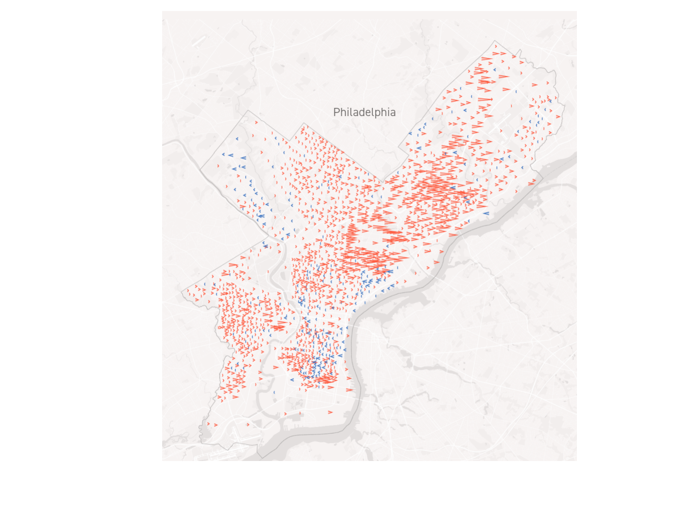
What About Philadelphia?


Analyzing Philadelphia, Politico found a similar pattern: "These patterns played out across the city, with turnout particularly down ⇓ in Black and Hispanic precincts and white precincts a more mixed bag. (Those big turnout spikes? ⇑ College campuses that were largely empty in 2020.)"


Image 2
Figurex 1
Image 2
Figurex 1

Figure 12. I’ve tried to make these maps line up well, but it isn’t perfect, sorry. (1,2); (1) GOP/Dem vote trends and (2) decline in turnout from 2020 to 2024 (source); (2) racial composition (via this Facebook post; the "real source" is here I think, but can’t find the version of the map in that facebook post (full, not fuzzy, with legend)); (3) Per capita income; green is higher than city average ($44,966/year), yellow is average, red is below (source) (4) Median income per zipcode (the numbers on the map are zipcodes, not median incomes) (source);


Table PA.GOP.Income - Correlation of county income metrics with county ΔActualGOP
Type A-GOP TO 20 A-GOP TO 24 ΔA-GOP TO Corr(Median Income) Corr(Poverty) Corr(Poverty150) Corr(Gini)
All 0.32711553 0.34395654 0.01684102 -0.18043532 0.10694281 0.06641153 -0.21361557
Rural (34) .44780731 0.47046135 0.02265404 0.09621908 -0.00686189 -0.19632729 -0.13381793
Rural+ Suburban.36782643 0.38521384 0.0173874 -0.18437117 0.17478795 0.0972542 -0.14489779
Suburban (31) .34975454 0.3662806 0.01652606 -0.2767552 0.35720165 0.29306371 -0.0799348
Suburban+ Urban.30685502 0.32290388 0.01604886 -0.22875874 0.18962963 0.17798802 -0.21117683
Urban (2) .18286763 0.19325683 0.0103892 -1. 1. 1. 1. ]

Table PA.GOP.Racial - Correlation of county racial composition with county ΔActualGOP
Type A-GOP TO 20 A-GOP TO 24 ΔA-GOP TO W:B:L:A:AI Corr(white) Corr(black) Corr(Latino) Corr(Asian+) Corr(AIAN)
All 0.32711553 0.34395654 0.01684102 0.17738492 -0.12419298 -0.07287509 -0.29555796 -0.24607773
Rural (34) .44780731 0.47046135 0.02265404 -0.12602848 0.19238166 0.1022962 0.05061416 -0.21885952
Rural+ Suburban.36782643 0.38521384 0.0173874 0.12505732 -0.03700293 -0.06392656 -0.25820148 -0.23877959
Suburban (31) .34975454 0.3662806 0.01652606 0.19881987 -0.12928379 -0.03260466 -0.40539548 -0.22384007
Suburban+ Urban.30685502 0.32290388 0.01604886 0.24706608 -0.21476987 -0.02072752 -0.43454596 -0.22340178
Urban (2) .18286763 0.19325683 0.0103892 -1. 1. 1. 1. 1. ]

Table PA.Dem.Income - Correlation of county income metrics with county ΔActualDem
Type A-Dem TO 20 A-Dem TO 24 ΔA-Dem TO Corr(Median Income) Corr(Poverty) Corr(Poverty150) Corr(Gini)
All 0.33506975 0.33222704 -0.00284271 -0.14891139 -0.29038008 -0.14294452 -0.28896793
Rural (34) .18472739 0.18698888 0.00226149 0.34016709 -0.20727817 -0.40238046 -0.05994887
Rural+ Suburban.3011713 0.29972392 -0.00144738 -0.18095676 -0.20329443 -0.06074593 -0.2691826
Suburban (31) .32748212 0.32476207 -0.00272005 -0.23483991 -0.2752844 -0.00701784 -0.34903316
Suburban+ Urban.3603077 0.35639727 -0.00391043 -0.17229817 -0.37361775 -0.14473509 -0.3431632
Urban (2) .45517958 0.45095053 -0.00422905 1. -1. -1. -1. ]

Table PA.Dem.Racial - Correlation of county racial composition with county ΔActualDem
Type A-Dem TO 20 A-Dem TO 24 ΔA-Dem TO W:B:L:A:AI Corr(white) Corr(black) Corr(Latino) Corr(Asian+) Corr(AIAN)
All 0.33506975 0.33222704 -0.00284271 0.45081979 -0.35206295 -0.38773463 -0.31472875 -0.23047803
Rural (34) .18472739 0.18698888 0.00226149 -0.21183827 0.26761843 0.28608718 0.41113517 -0.10190185
Rural+ Suburban.3011713 0.29972392 -0.00144738 0.43344537 -0.31871086 -0.34872169 -0.27828912 -0.18715713
Suburban (31) .32748212 0.32476207 -0.00272005 0.66872753 -0.54064093 -0.46395146 -0.39225567 -0.19537396
Suburban+ Urban.3603077 0.35639727 -0.00391043 0.61860579 -0.48944724 -0.50447135 -0.4219452 -0.2593939
Urban (2) .45517958 0.45095053 -0.00422905 1. -1. -1. -1. -1. ]

Image 2
Figurex 1
Image 2
Figurex 1

CAPTION (1);


Other Cities


In fact, Politico found a similar trend in other cities. They report as follows: Phoenix turnout fell 4.6 pp, while Arizona’s rose 0.6 pp. Philadelphia’s turnout fell 3.7 pp, Pennsylvania’s turnout rose 1.9 pp. Charlotte’s turnout fell 6.7 pp, North Carolina’s turnout rose 3.1 pp. Las Vegas turnout rose 4.9 pp, but Nevada turnout rose even more: 6 pp. Milwaukee’s turnout fell 0.4 pp, Wisconsin’s turnout rose 3.8 pp. Atlanta’s turnout rose 2.4 pp, but Georgia’s turnout rose even more, at 5.6 pp. And all of these meant that Trump, thanks to falling blue turnout, saw greater margin increases in these cities than their respective states (except Atlanta, Georgia). Notice these state turnouts are different than I report in Table SSA.I, likely because Politico is using a different eligible voter population (I’m going with the University of Florida values for my calculations, from which I can tell, are the most accurate/studied available). Nevertheless, the trends are indicative - and they meant, as Politico analyzes, the relative ceding of electoral power to the more conservative suburbs and rural areas.


What precisely happens? As Politico reports, " the greatest decline in voter participation in all six appears to be in predominantly low-income Black and Hispanic neighborhoods. There were some shifts toward Trump, but it was ultimately the turnout drop in staunchly Democratic precincts that had the greatest impact on urban margins." In precincts that were at least 85% black, Trump did gain 3.4k votes. But the bigger factor is Harris simply losing 17.3k votes (compared to 2020). Turnout fell in these precincts by 6.1%, "more than double the 2.7 percent falloff seen across the cities overall. ... And it split along income and educational lines, with the highest drops coming in neighborhoods where residents have the lowest incomes and are least likely to be college-educated."


Interestingly, regarding the prediction that black lower-income turnout would fall and black higher-income turnout would rise, Politico reports: "In the lowest-income Black areas — where most households make less than $50,000 per year — turnout dropped 7 percent. In higher-income precincts, the decline was 4 percent. Similar gaps exist among precincts with varying education levels." This suggests black turnout fell across income groups, but fell harder among lower-income. Specifically, they report that for black <$50k, total votes fell 6.9 pp, and for black $50k+, turnout fell only 4.0 pp. This isn’t necessarily out of line with the argument that black $100k+ turnout rose, since we found that black $50k-$99.999k turnout fell dramatically - but the scale of this fall is likely incorrect, due to the impossibly high black $50k-$99.999k 2020 turnout suggested by the exit polls (similar turnout splits were seen for "up to high school" vs "attended any college" educational attainment; however, Trump’s gains among any of these groups were around +1.8/+1.9 pp).


Some Democrats blame the party’s inability to drive home a message that would inspire working class voters of color.


Mustafa Rashed, a Philadelphia-based Democratic strategist, pointed to that final late-night rally in the city in which Harris urged a crowd of 30,000 to “finally turn the page on a decade of politics that has been driven by fear and division” and praised Republicans “who put the Constitution of the United States above party.”


That was a glaring miss, he said — playing up the need for voters to save democracy when polls showed the economy and immigration were consistently the top concerns for voters.


“Saying to urban voters that you have to help prevent fascism and help save democracy, people are like, ‘I don’t know what that means,’” he said. “[The party was] asking people to uphold systems that they don’t believe, by and large, are working for them.”


Hispanic neighborhoods saw sharper declines, with a sharper swing than black neighborhoods to Trump amidst this.


The majority-Hispanic neighborhoods in the six cities almost universally broke for Trump. That rightward shift was consistent across cities, income levels and country of origin. And those breaks to the right are not explained just by falling Democratic turnout alone — they were large enough to make it clear that vote-switching occurred.


Overall, in 85%+ Hispanic precincts, Trump gained 8.2 pp, and turnout fell by 11+ pp.


Charito Morales, who did voter outreach for Harris in the Fairhill neighborhood of Philadelphia, said she thought many were voting to punish Harris for a range of issues, from the economy, to the Gaza genocide, to the Biden administration failing to follow through on promises for protection of undocumented immigrants. I’m not sure if I totally buy this, but she is on the ground, so it seems worth mentioning here.


What we see in the cities is a bloodbath for Democrats, and indicatively, more so in lower income areas of cities, across racial lines - though white-majority neighborhoods are almost always higher-income (relatively speaking), so the relevant trend isn’t as much observed there.