As the Financial Times reports, low turnout among low-income voters killed Harris. In NY, IL, FL, TX, OH, and VA, she lost 3.0m compared to 2020. Swing states were less harsh on her (with some gains, ie in WI and GA), but including them, her losses are 3.1m.
Trends based on race are a bit easier to detect, because we have actual composition values for each county (it would be helpful if we had composition values of income groups for states). Race is indicative not only of the particular issues relevant to a racial group, but also income. Nationally, across all racial-groups, 59.1% of households make <$100k, and 31.3% <$50k. For "white alone, not Hispanic" households, it’s 55% and 27.8%. For "black alone" households, its about 74.0% and 44.8%. For "Hispanic (Any Race)" households, 68% and 37%. For "Asian alone" households, 44.0% and 22.6%. For "American Indian and Alaska Native alone" households, its 72.9% and 41.6%. Altogether, to be white or Asian is to be disproportionately higher-income, and otherwise to be disproportionately lower-income, compared to the typical household nationally. Of course, every racial group is highly classed (45% of white households $100k+, black 26%, Latino 32%, Asian 56%, AIAN 27.1%; and, as a specific example, Charles County MD has a relatively low Gini coefficient for a US county (0.3835), a high median income ($116,882), and is nearly majority black (48.5%)), but the huge differences for some groups (especially black households) can also give some indication of income distributions, given the fuzzy picture the income indicators give.
A more granular approach could be undertaken by looking at township-level data (or the relevant subunit for a county in a state). But this would be far more tedious data to collect, so I haven’t done that here. All that said, can we use county data to discern income-based trends? I think so. At least a rough picture.
2020 and 2023 county-level populations from Census Office; County-level total votes in 2020 and 2024 from Wikipedia; 2015 county-level Gini coefficients from here; county-level <18-year-old percent (100 - <18% = 18+%), households below poverty, persons below 150% of the poverty threshold, income level, and racial composition from NIH. Rural, Suburban, and Urban classification of counties from Pew (higher resolution version of that map here).
2020 and 2023 county-level populations from Census Office; County-level total votes in 2020 and 2024 from Wikipedia; 2015 county-level Gini coefficients from here; county-level <18-year-old percent (100 - <18% = 18+%), households below poverty, persons below 150% of the poverty threshold, income level, and racial composition from NIH. Rural, Suburban, and Urban classification of counties from Pew (higher resolution version of that map here).
From 2019, it appears that, for Miami-Dade, "White, not Hispanic" had a median income (poverty level) of $82,099 (9.5%), black $37,839 (24.9%), Hispanic/Latino $49,272 (16.8%), Asian $70,150 (15.0%), American Indian $48,828 (11.8%). For Florida altogether, it’s "White, not Hispanic" $61,682 (10.0%), black $41,702 (22.0%), Hispanic/Latino $49,266 (17.7%), Asian $72,205 (11.8%), American Indian $48,608 (16.6%).
Even these then, should be taken with a grain of salt.
Swing States
If you point out that Harris lost millions of votes across the country, some will retort that swing states actually saw, generally speaking, a rise in turnout. Here’s the NYT (my emphasis):
If you’ve been reading post-election coverage, you’ve probably seen one of the big takeaways from the returns so far: In counties across the country, Kamala Harris won many fewer votes than Joe Biden did four years ago.
...
As such, it’s tempting to conclude that Democrats simply didn’t turn out this year — and that Ms. Harris might have won if they had voted in the numbers they did four years ago.
This interpretation would be a mistake.
For one, the story doesn’t apply to the battlegrounds, where turnout was much higher. In all seven battleground states, Mr. Trump won more votes than Mr. Biden did four years ago.
More important, it is wrong to assume that the voters who stayed home would have backed Ms. Harris. Even if they had been dragged to the polls, it might not have meaningfully helped her.
How is that possible? It’s because the low turnout among traditionally Democratic-leaning groups — especially nonwhite voters — was a reflection of lower support for Ms. Harris: Millions of Democrats soured on their party and stayed home, reluctantly came back to Ms. Harris or even made the leap to Mr. Trump. And if those who stayed home had voted, it wouldn’t have been an enormous help to Ms. Harris, based on Times/Siena polling linked to validated records of who did or didn’t vote.
On the last remark - that soured-Dem voters might have made the election worse: maybe Harris shouldn’t have run a campaign that soured these voters!
But on to the main point.
The idea of "but swing states saw higher turnout" is that, unlike the rest of the country, turnout rose; therefore, where Harris lost votes, maybe (A) those were due to voters switching to the Republicans from the Democrats and/or (B) Dem turnout largely held out, sometimes eroding, sometimes even gaining (which is true, in terms of gross numbers). So then the picture isn’t quite that Harris "lost votes".
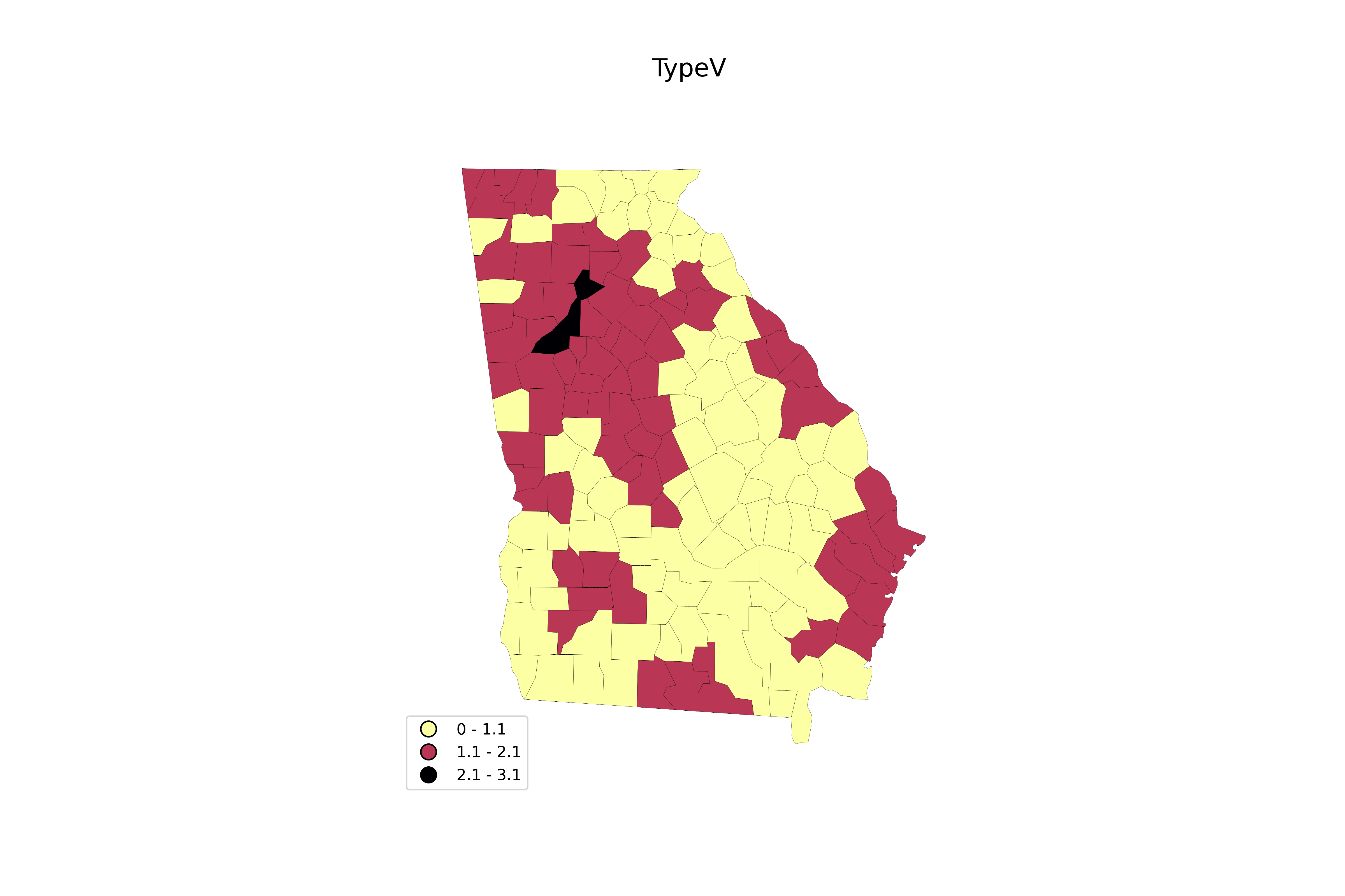
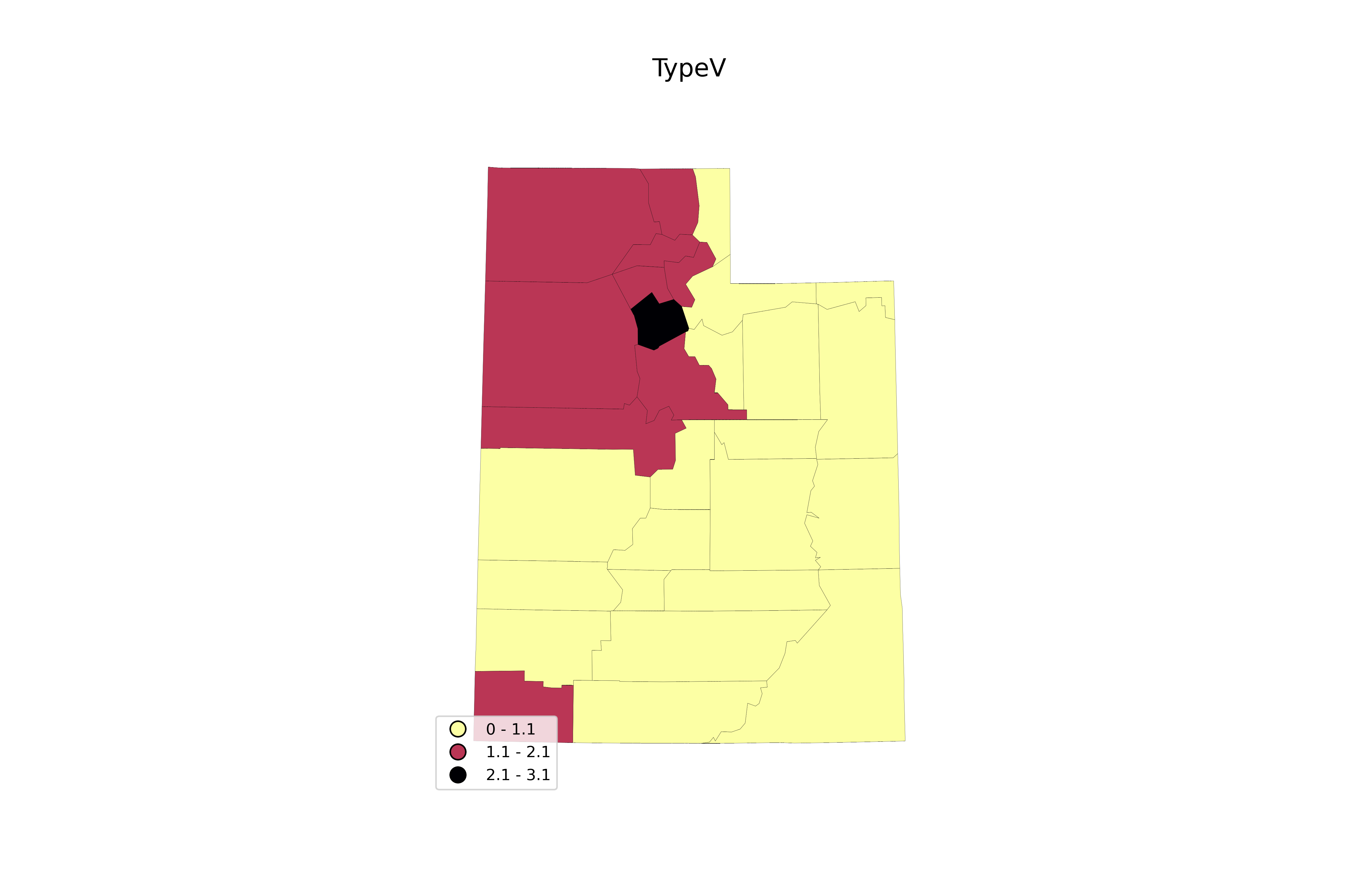
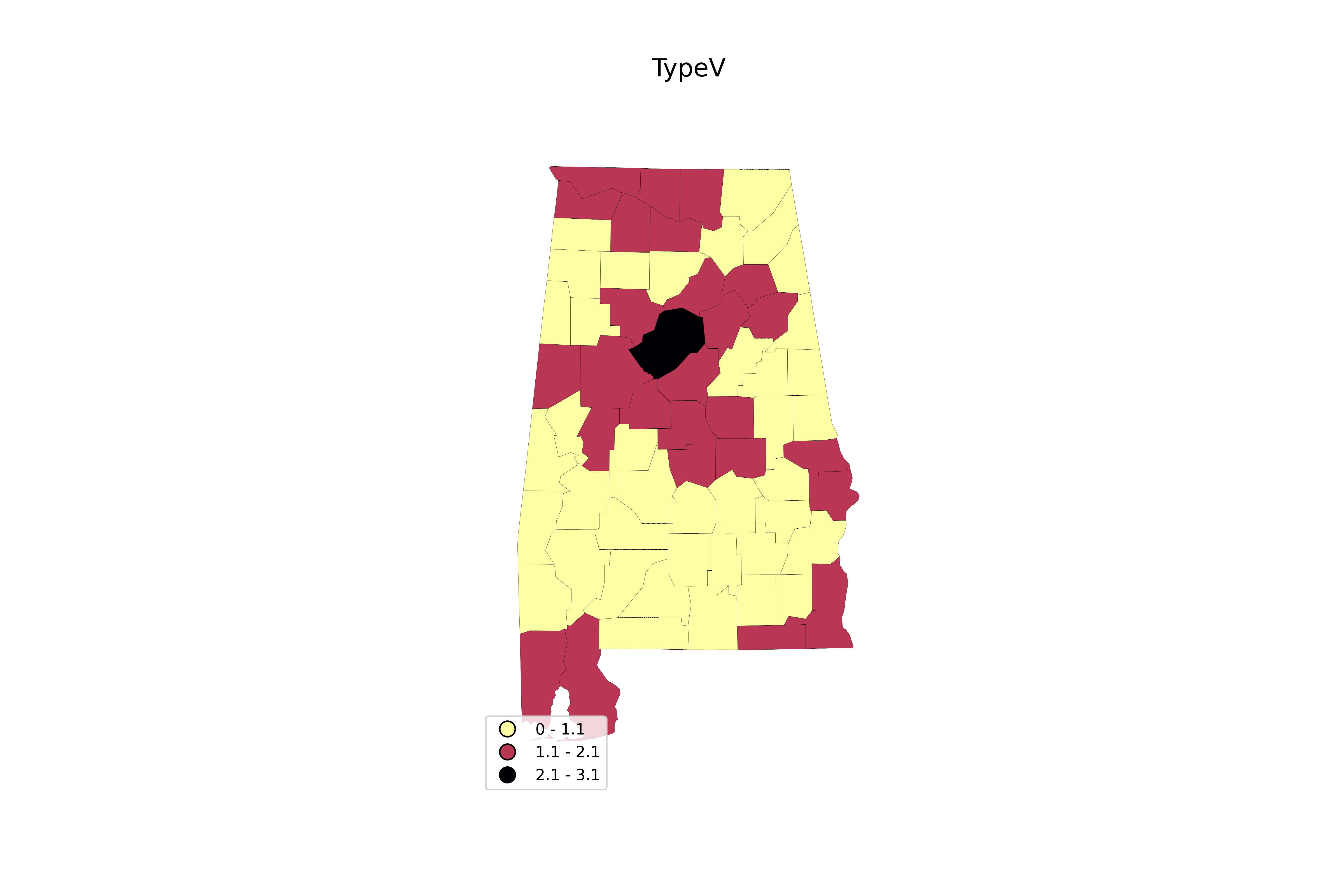
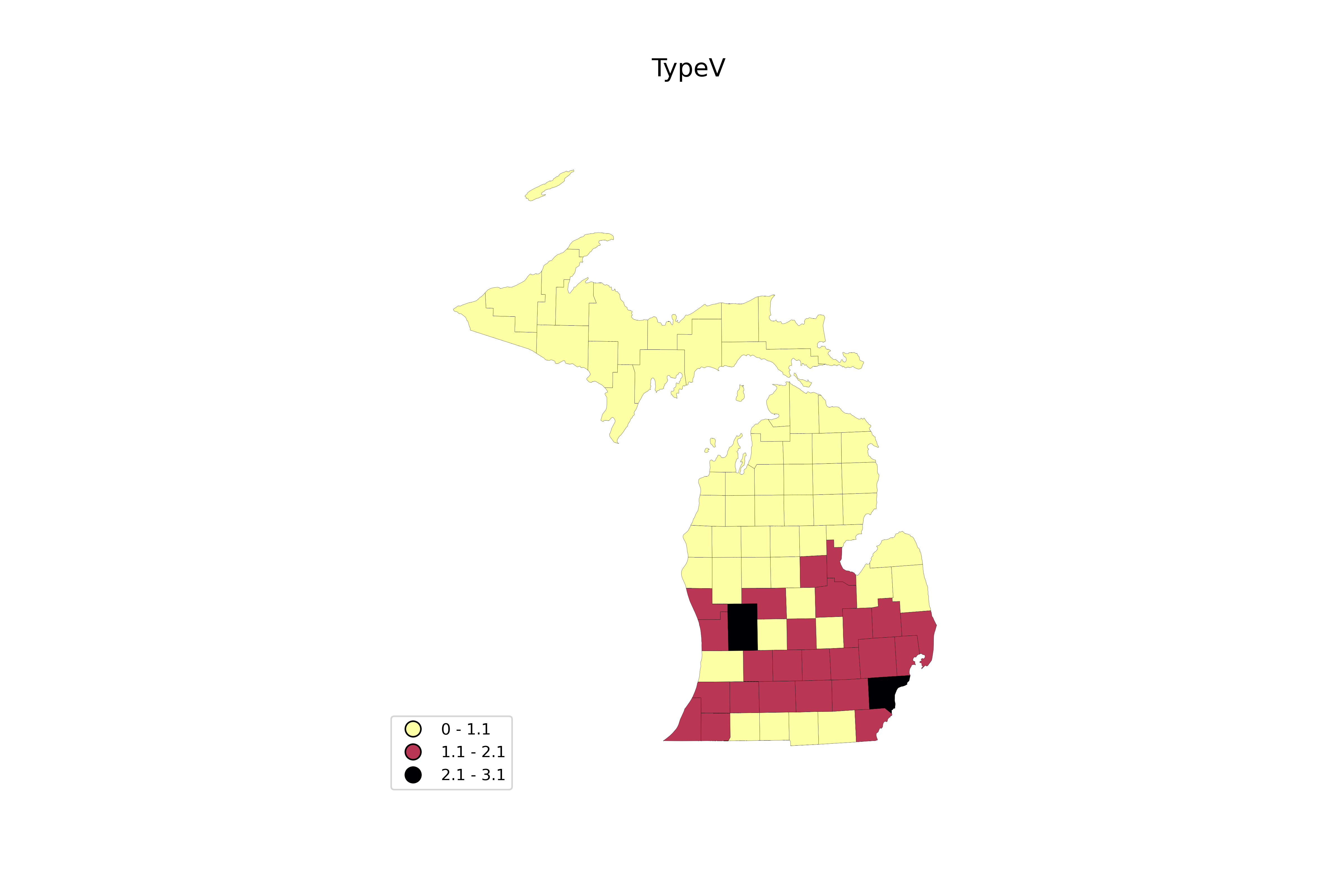
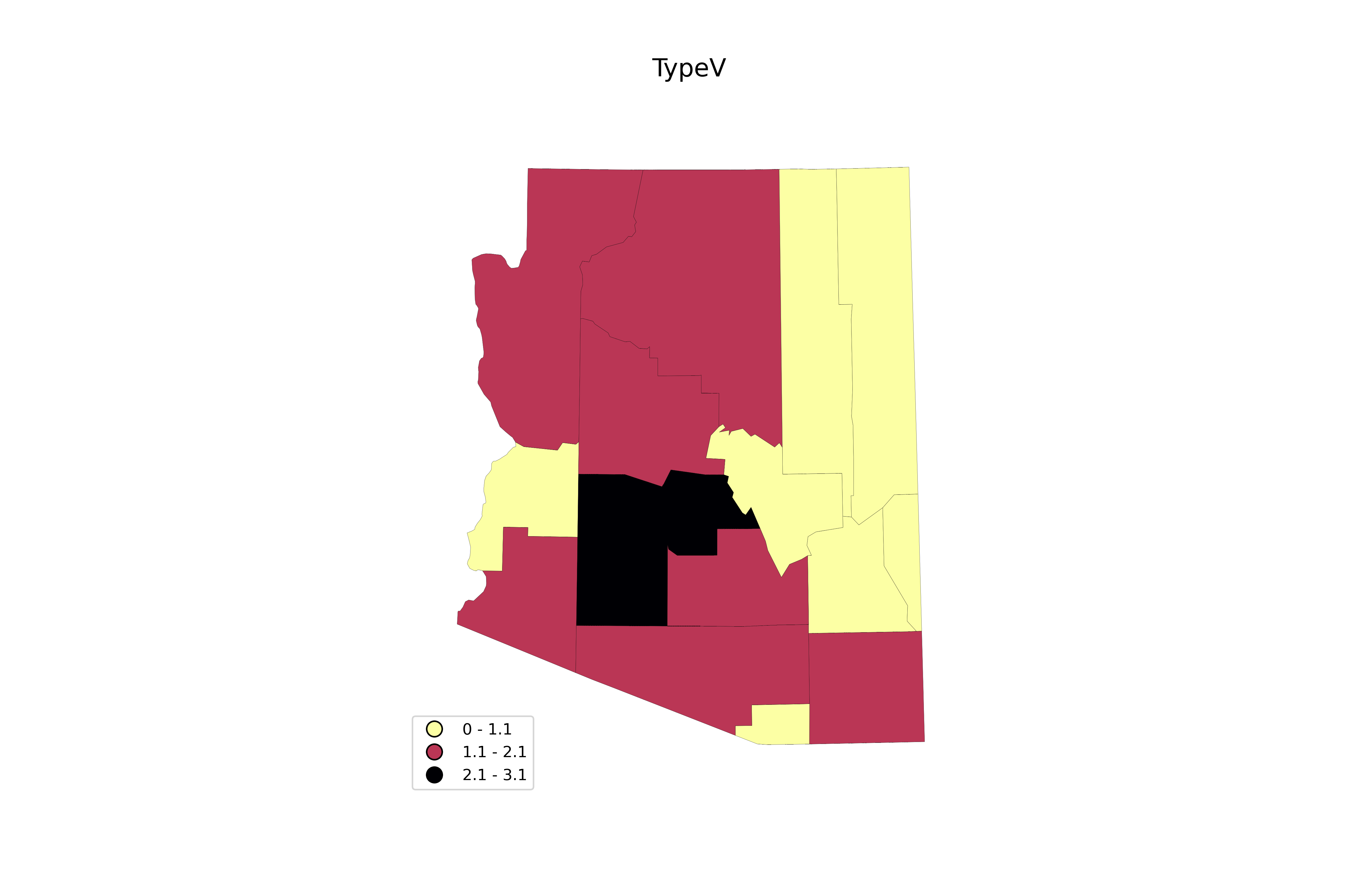
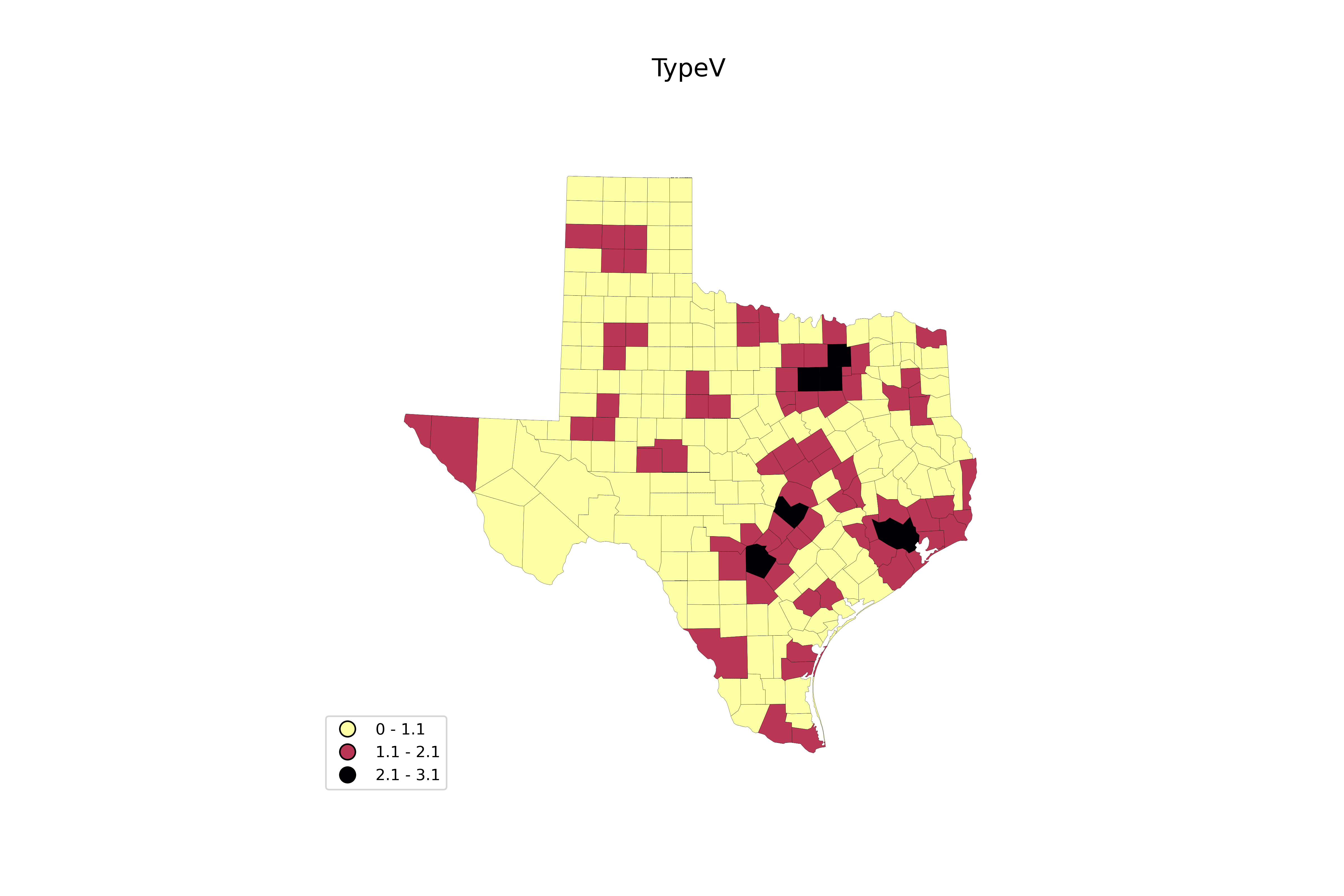
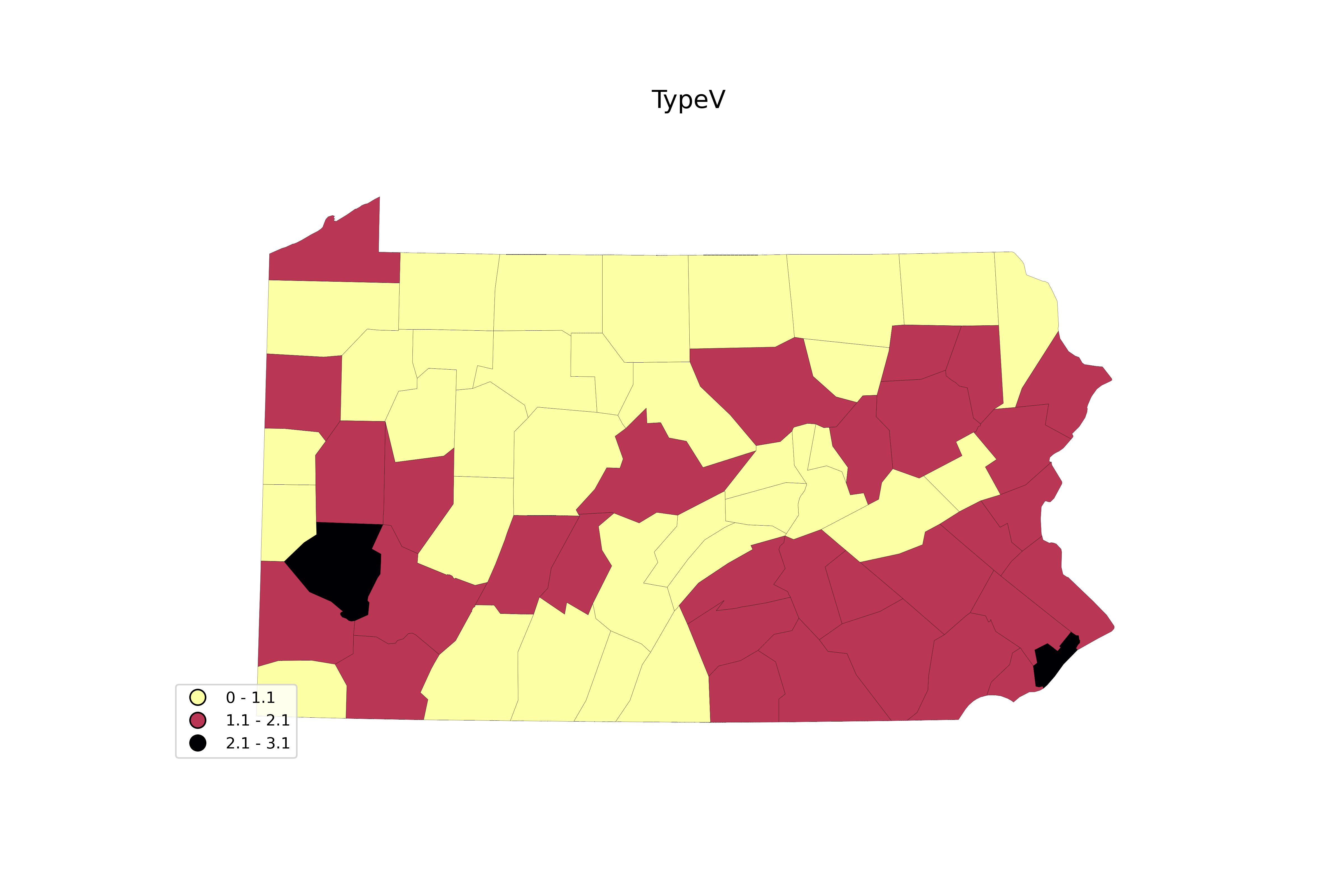
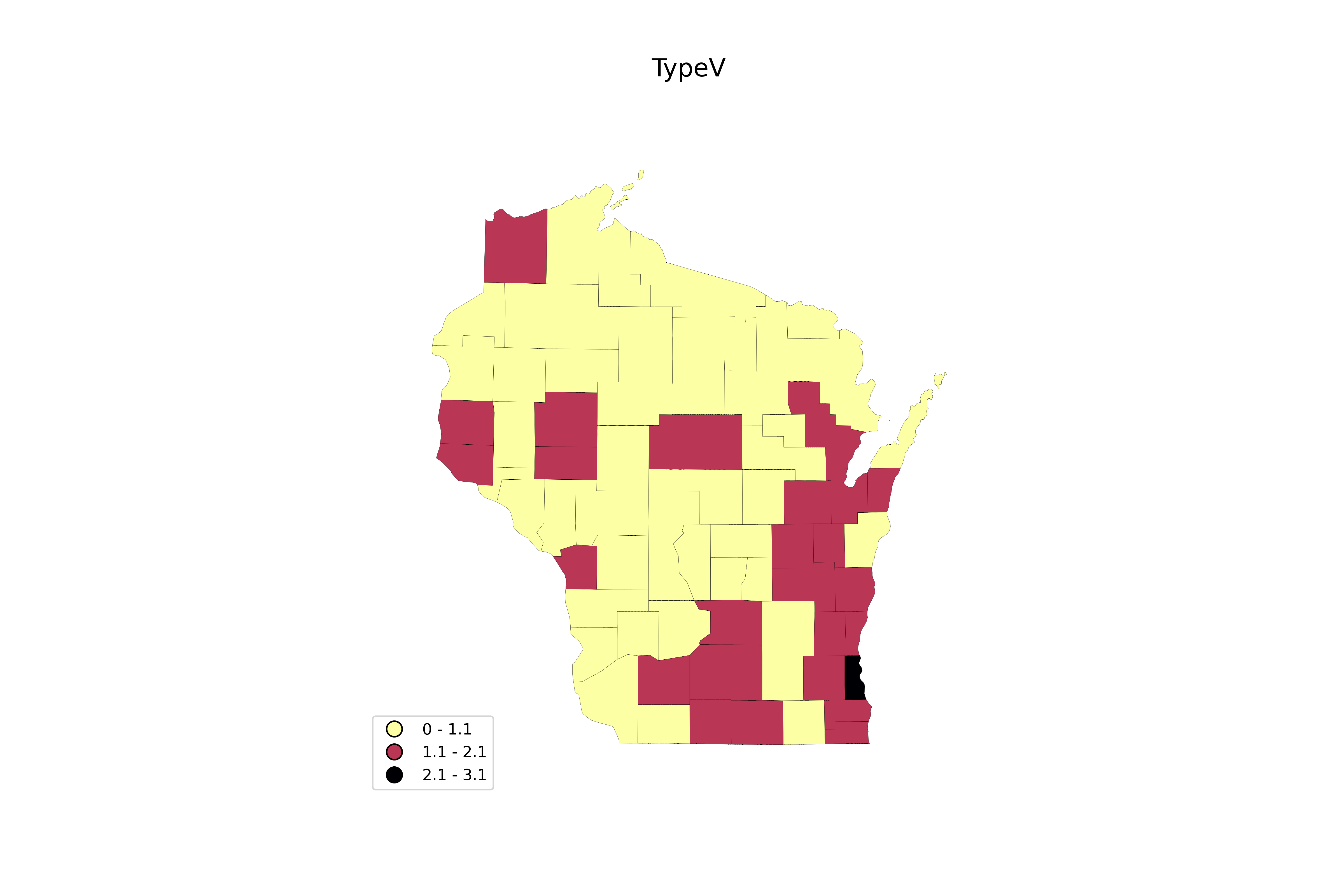
There’s clearly some issues in this argument. But the data bears it out quite clearly. In Michigan, Arizona*, Wisconsin, Georgia, Dems saw rising turnout in higher-income counties and falling turnout in counties with increasing poverty. In Pennsylvania, Dems saw falling turnout in counties with higher poverty and inequality, with no accompanying uptick in higher-income counties.
For the GOP, there was no significant trend with economic factors in Michigan, Georgia, Pennsylvania, and Wisconsin. In Arizona, they saw falling turnout with income and rising with poverty and inequality, though Arizona’s correlations should be taken with a grain of salt, as they have only 15 counties (thus fewer "data points").
What this means is that in 2024 "battleground states", voters by these economic factors didn’t change their opinion much on Trump, but generally lower-income voters soured on Harris, and higher-income voters found her more appealing.
In terms of race, the Dems saw rising turnout in whiter counties and falling turnout in blacker counties in Michigan and Georgia, and the same in Pennsylvania except with falling turnout also in more Latino and Asian counties. In Wisconsin, the negative trend was with more Asian counties, and positive with American Indian. In Arizona, turnout rose in whiter, blacker, and more Asian counties, and fell in American Indian counties (again, with the above caveat).
For the GOP, there were no significant trends in Michigan. In Georgia, turnout increased with whiter counties, and fell in blacker and more Asian counties. In Wisconsin, turnout increased with whiter counties, and fell with more Latino and Asian counties. In Pennsylvania, turnout fell with Asian and American Indian voters. In Arizona, they saw the opposite trend as Democrats in the state - falling with whiter, blacker, and more Asian counties, and rising with American Indian counties.
Overall, for Dems, we see a fall in support among non-whites, and a rise with whites. For the GOP, it’s more scattered, but whites appear to have generally voted for them more, and Asians fell off more frequently.
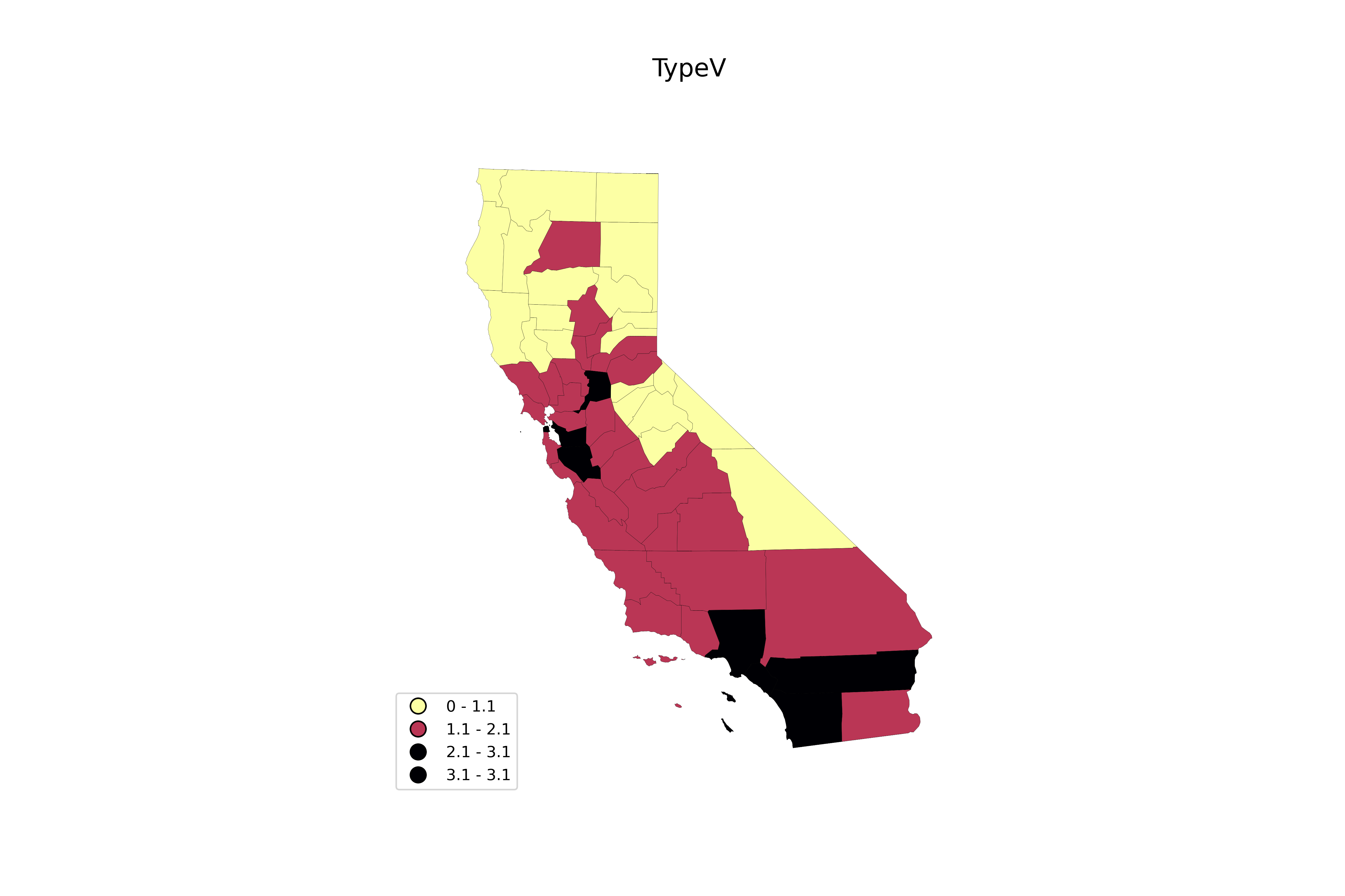
Overall then, it’s the same story we see nationwide. But state-by-state, the pattern is more scattered outside the swing states. In terms of income, the trend is similar in Texas and Ohio. In Florida, Dems saw falling turnout with increasing inequality, and the GOP saw no significant trends. Further outside the trend, in California, it appears the GOP made gains in more impoverished counties, while Democrat turnout fell off in higher income counties.
In terms of race, Democrats fell off with blacks and Latinos in California, but saw correlation with white and American Indian counties. The GOP saw nearly the opposite case. In Texas, there was no overall trend for the GOP, but the Dems saw rising turnout in white counties, and falling turnout in Latino counties. In Florida, its similar to Texas, except the GOP saw near-moderate negative correlation with more Asian counties, and the Dems also saw fall off in black and Asian counties. In Ohio, the Dems turnout was correlated with whiter counties, and negatively correlated with blacker counties, while the GOP saw near-moderate negative correlation with black and Asian counties.
To temper your interpretation of these correlations, let’s consider the change in actual vote share for the parties (change in {total vote for a party divided by the eligible voters}).
First, the swing states. The GOP saw gains of 2.2 pp and the Dems fell 0.7 pp in Michigan. In Georgia, the GOP gained 1.6 pp and the Dems 0.08 pp. In Pennsylvania, the GOP gained 1.7 pp, and the Dems lost 0.3 pp. In Wisconsin, the GOP gained 1.8 pp, and the Dems gained 0.7 pp. In Arizona, the GOP gained 0.9 pp, and the Dems lost 2.5 pp.
For the other states now. In Ohio, the GOP gained 0.3 pp, and Dems lost 1.5 pp. In Florida, the GOP gained 0.9 pp, and the Dems lost 4.8 pp. In Texas, the GOP gained 1.1 pp, and the Dems lost 2.9 pp. In California, the GOP gained 0.7 pp, and the Dems lost 7.5 pp.
Overall then, we see (1) a rise in actual Trump vote, with weaker rise in actual Dem vote (GA, WI), (2) a rise in actual Trump vote, with a weak fall in actual Dem vote (MI, PA), and (3) a rise in actual Trump vote, and a substantially larger fall-off in Dem vote (OH, FL, AZ, TX, CA). The first two patterns seem more common in the swing states. For (3) especially, interpretations of the correlations should be tempered with these varying turnout changes.
What all of the above indicates is that (A) Harris’s alienization of low-income and non-white voters was especially strong in the swing states, and (B) this cost her significant turnout, and likely multiple swing states (consider that Trump’s vote change largely didn’t correlate with economic factors, whereas Harris’s did).
The idea then that "the swing states saw increasing/stable turnout, so let’s ignore the national electoral problems" is an utter mistake. It’s the same basic problem, albeit compressed into less dramatic turnout changes.
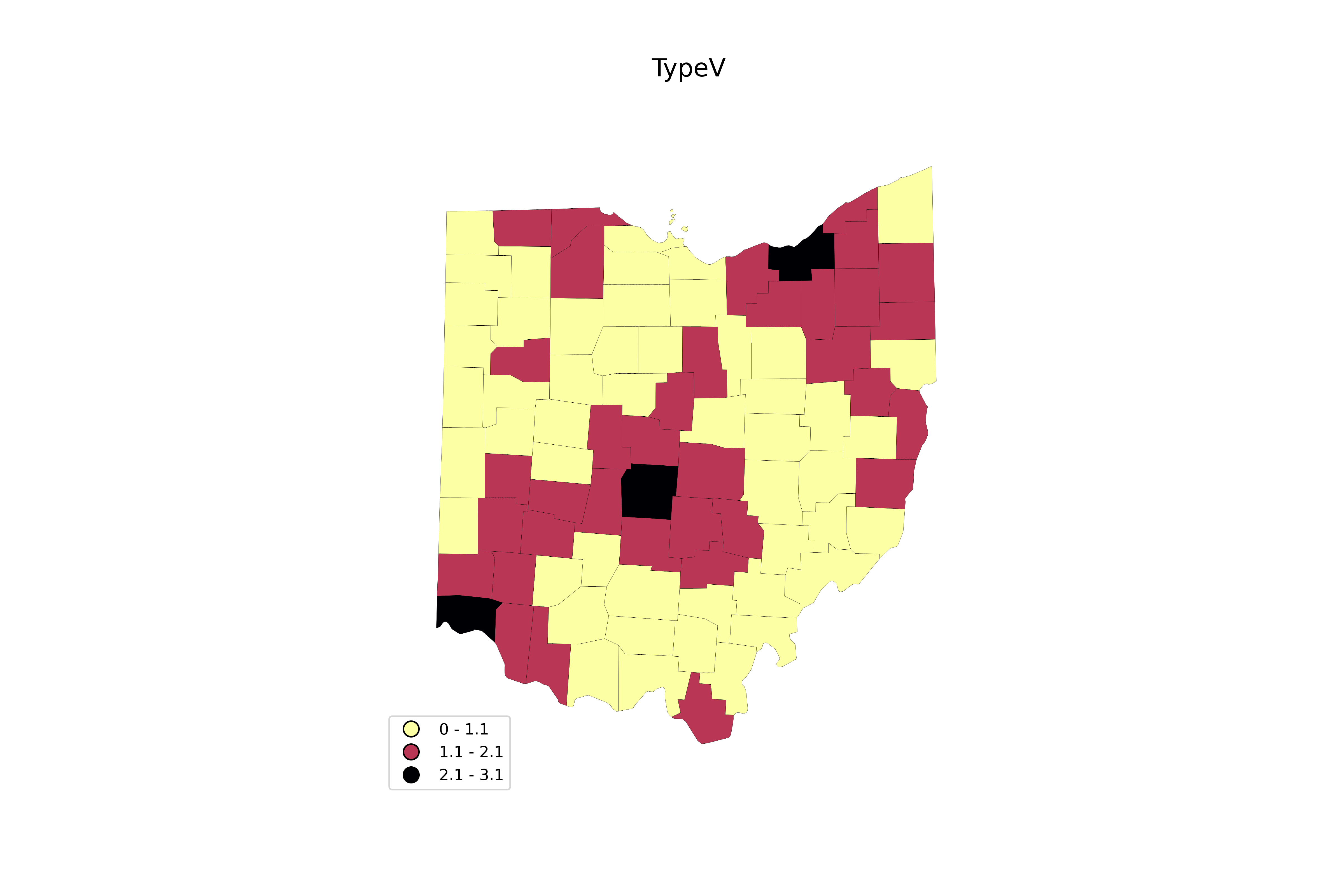
Ohio
See here for analysis of Ohio. Particularly, long-term trends and how labor populist Sherrod Brown performed.
This could be addressed by looking at turnout in sub-county units (ie townships), although that sounds a bit tedious for the moment.
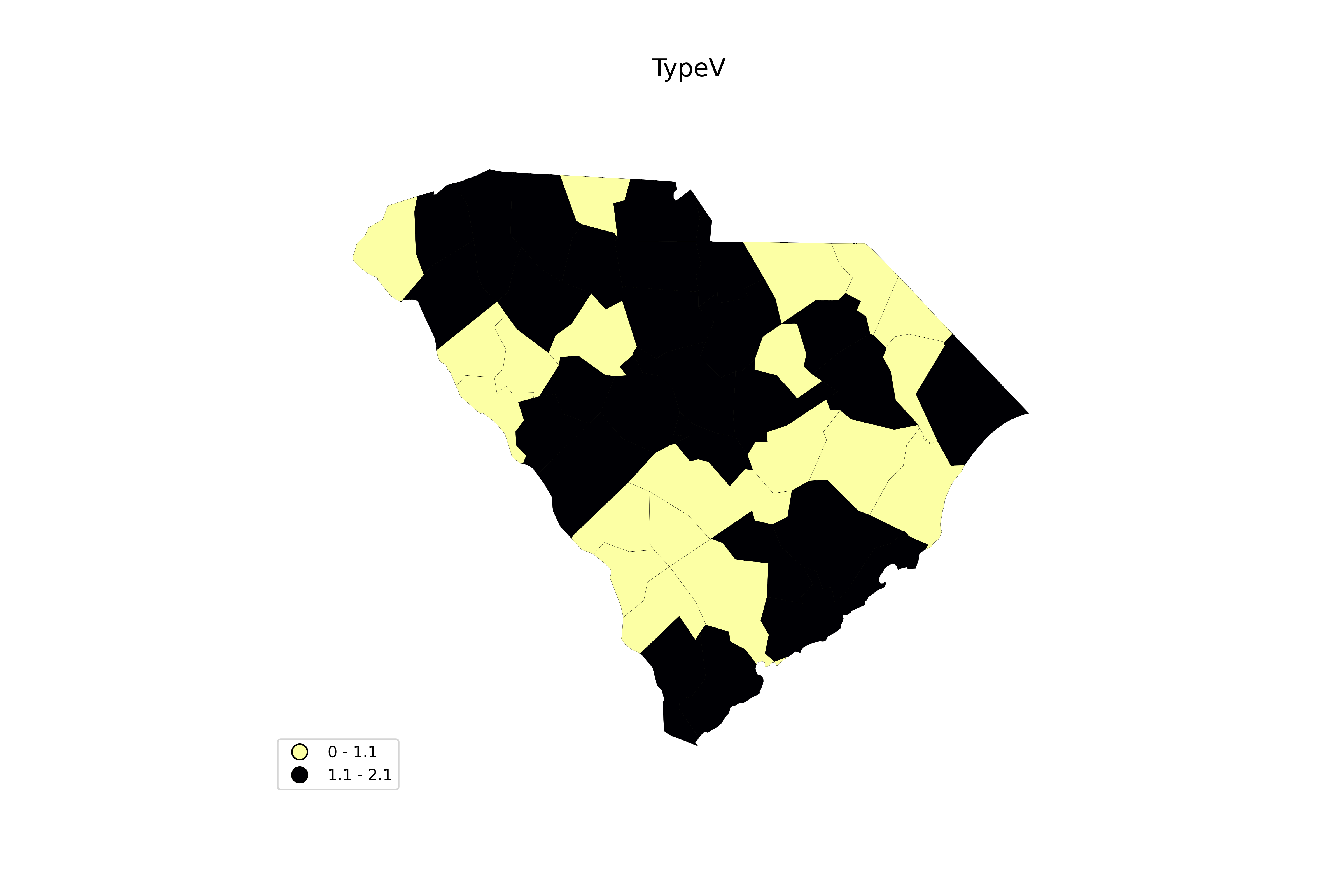
In South Carolina, the results are much more stark. County-by-county, the average turnout change was -1.6 ± 4.9 pp (falling in 68% of counties); for urban, -0.5 ± 2.8 pp (falling in 62% of counties); for rural, -2.5 ± 5.9 pp (falling in 76% of counties) (standard deviation, not error of mean, reported here). For all urban counties eligible populations and votes added together, turnout rose 0.27 pp from 2020 → 2024. For rural, turnout fell 0.45 pp. Overall, the correlation with increased turnout and median county household income was 0.60. For rural counties, it was 0.67, and for urban counties, it was 0.46. In other words, the more income, the more turnout here.
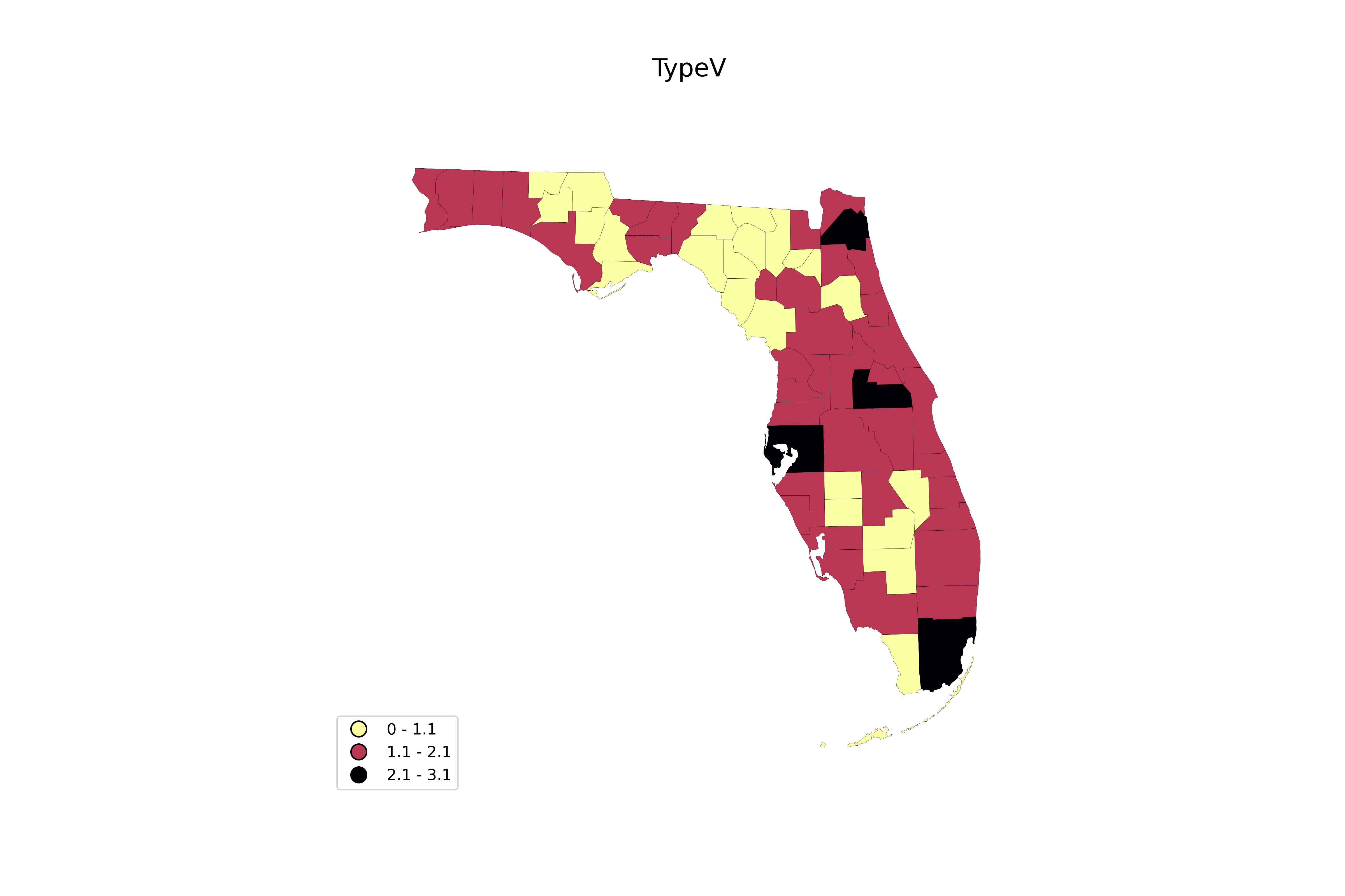
Looking at Florida, I noticed a few interesting patterns.
TO DO: include links to sources of data used here, etc
What if we look at black [very super] majority counties? Below, I’ve computed change in votes for counties that are 70%+ black, along with their median income and poverty rate (as per the Census Office).
While a more thorough county-by-county analysis of each state in question is needed for a better conclusion, it’s clear that (A) black very-super-majority counties are very poor and (B) that turnout fell here far more dramatically than the states they fall within (with only a couple exceptions, all in Louisiana, and these were barely exceptions; also all except Clayton County in Georgia fall in the <$50k household income bracket). This seems consistent with the argument of this article.
† W: White non-Hispanic (unless otherwise noted); B: Black; L: Latino ("Hispanic or Latino of any race"); A: Asian
* "White" here may includes Hispanic; unclear from Wiki text
** This data is from 2010. "White" here includes Hispanic
The above table seems to imply that $100k+ turnout may have actually decreased, just slower than the <$100k turnout. (Although I need to look at overall turnout for their respective states for full picture; and still, counties aren’t perfect indicators). However, it’s worth noting that in those places where ΔTotal is worse than the state’s trend, such counties have a disproportionately large Asian population - and as we saw here, there was probably decline in Asian turnout across income groups. So if they are over-represented, it might bring down $100k+ turnout more than otherwise. However, it isn’t always the case that Asian over-representation leads to worse trends than the state. That said, further analysis is required.
I’ve also included results for Charles County, MD, as this is a nearly majority black county with high income. Notice, contra the declining black turnout in southern very-super-majority black counties (which are all low income), and the low-income black turnout in cities discussed above, that we see rising turnout overall, and more votes for Harris (and a decline for Trump). This seems to highlight the classed behavior among black people. I’ve included Napa, Santa Cruz, and Ventura counties (CA) for similar reasons, as they are high-income with a large share of Latinos (but not near majority, ranging from 34.8% - 43.3%). They trend slightly better for turnout than California as a whole.